Sambuddha Saha
Experience
Design Strategy +
Creative Direction
Driving Innovation
in Complex Ecosystems
+20YRS
2024–25
Writing & Consulting
2018–24
Lead Experience Design Strategist
Volvo Cars
2014–18
Startups & Consulting
2014–15
Experience Designer & Strategist
OpenTable
2011–13
Director of Experience Design
Telenav & Digitas
2005–10
Creative Director
Publicis Sapient & Coca-Cola
5 PRINCIPLES
facts have a context » peel the onion • all chambers echo » work the white space • analogies are cheap » reason from first principles • talk goes only so far » work reveals the pathways • interpretations diverge » draw together every day
SOME HIGHLIGHTS
+ Initiated the strategy practice in the experience design team at Volvo Cars
+ Built, (co-)led, and mentored global design teams of 20 to 40—research, interaction, visual & motion, content, prototyping—across locations & time zones
+ Worked on the cutting edge of consumer, employee and citizen engagement experiences • Omnichannel retail in fashion & automotive • Customer creativity in food & fashion • the Software-Defined Vehicle • Digital government services • Service workflow design
+ Defined and executed cross-cultural user research programs
+ Collaborated with companies at every scale—from 0–1 startups to global leaders, with varying degrees of maturity in digital practices
+ Co-founded/partnered two startups in apparel retail & marketing
+ Panel speaker at SxSW on the adoption of electric vehicles
automotive retail /
Volvo Cars OmniChannel Vision
Volvo Cars OmniChannel
Volvo Cars OmniChannel
2018-23 / Experience Strategy & Design
Flexible,
Connected,
Full-Lifecycle Car Shopping.
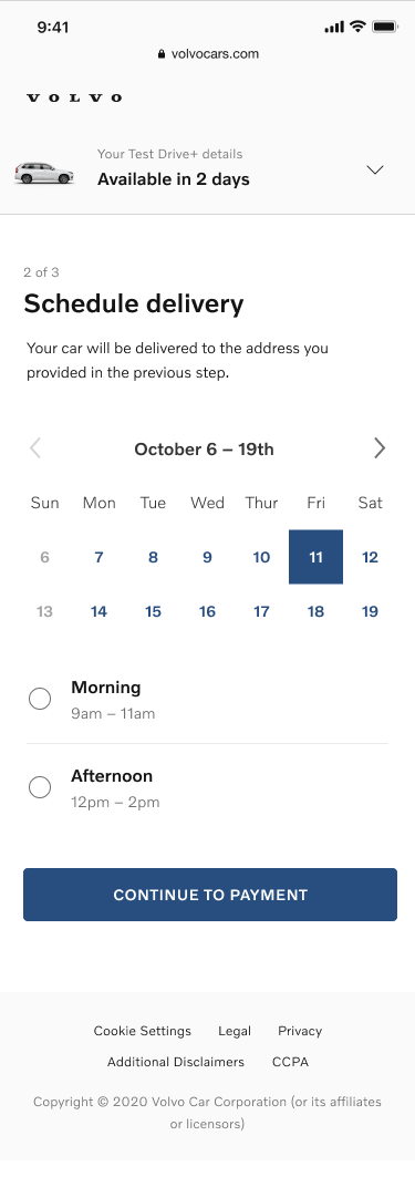
Transforming the typical 6-month chore of research & deliberation into driving a Volvo within a week
In the context of evolving consumer mindsets and the growth of shorter, more fluid models of access to private car use such as subscriptions, on-demand access, etc., we crafted a vision for a shopping journey that was radically faster, not draining of time, energy and goodwill, and the foundation of a positive relationship between the customer and retail.
To enable this, we proposed a more modular & flexible selection, configuration, and sequencing of the elements of the experience, utilizing digital technologies to:
Extend the core retail and dealership functions—product demo, test drive, financing, accessories, etc.—out into the customer’s world and timeframe, and build knowledge, trust and commitment earlier in the process
Increase customer satisfaction with their purchase by bringing more of the everyday ownership experience into the shopping process, allowing them to make better-informed decisions
Allow the different influencing parties—shopper, friends & family, retail, etc.—to play to their respective strengths by consolidating all information generated by the research process
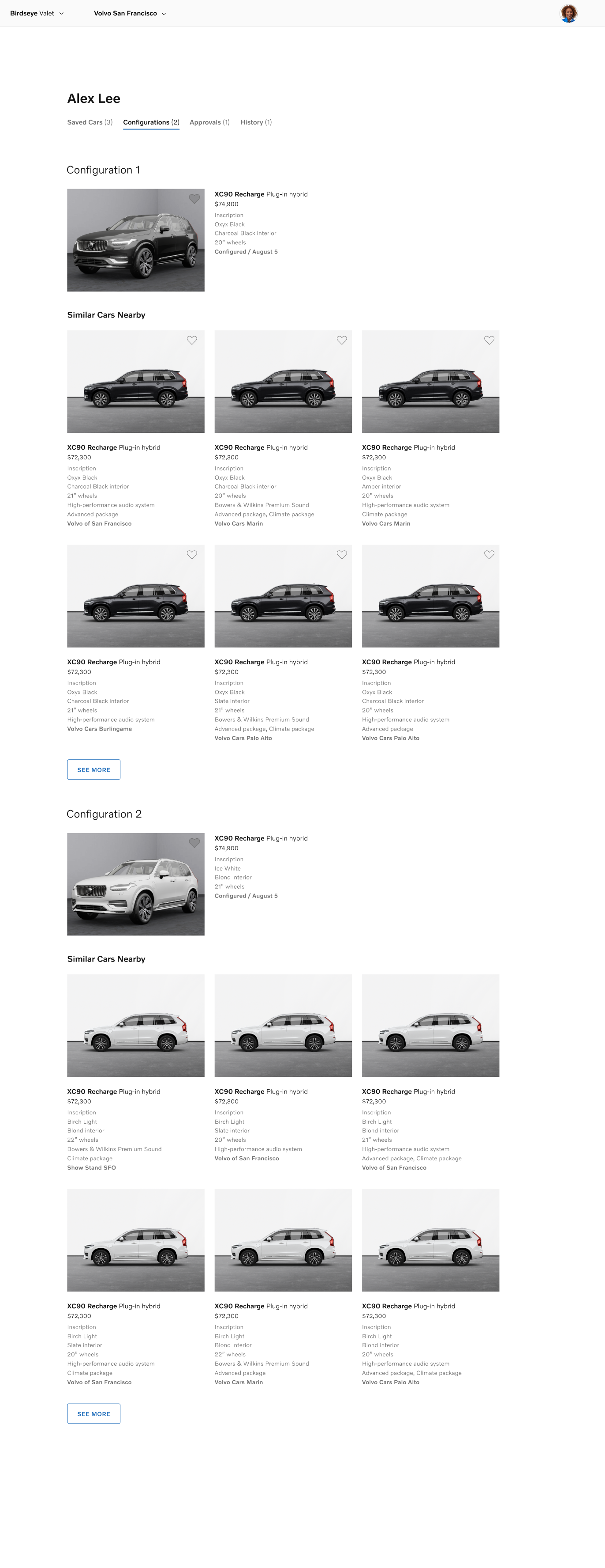
Apply ongoing intelligence to make everyday driving & ownership the basis for ongoing product optimization, and a more continuous relationship between the customer, their retailer, and the brand
creative community /
Cult Collection
2014-16 / Co-Founder, Strategy, Design, Product Management, Editorial & Marketing
A creative community for fashionistas to explore and shop their individual style—closing the loop between self-expression and the social context of consumption

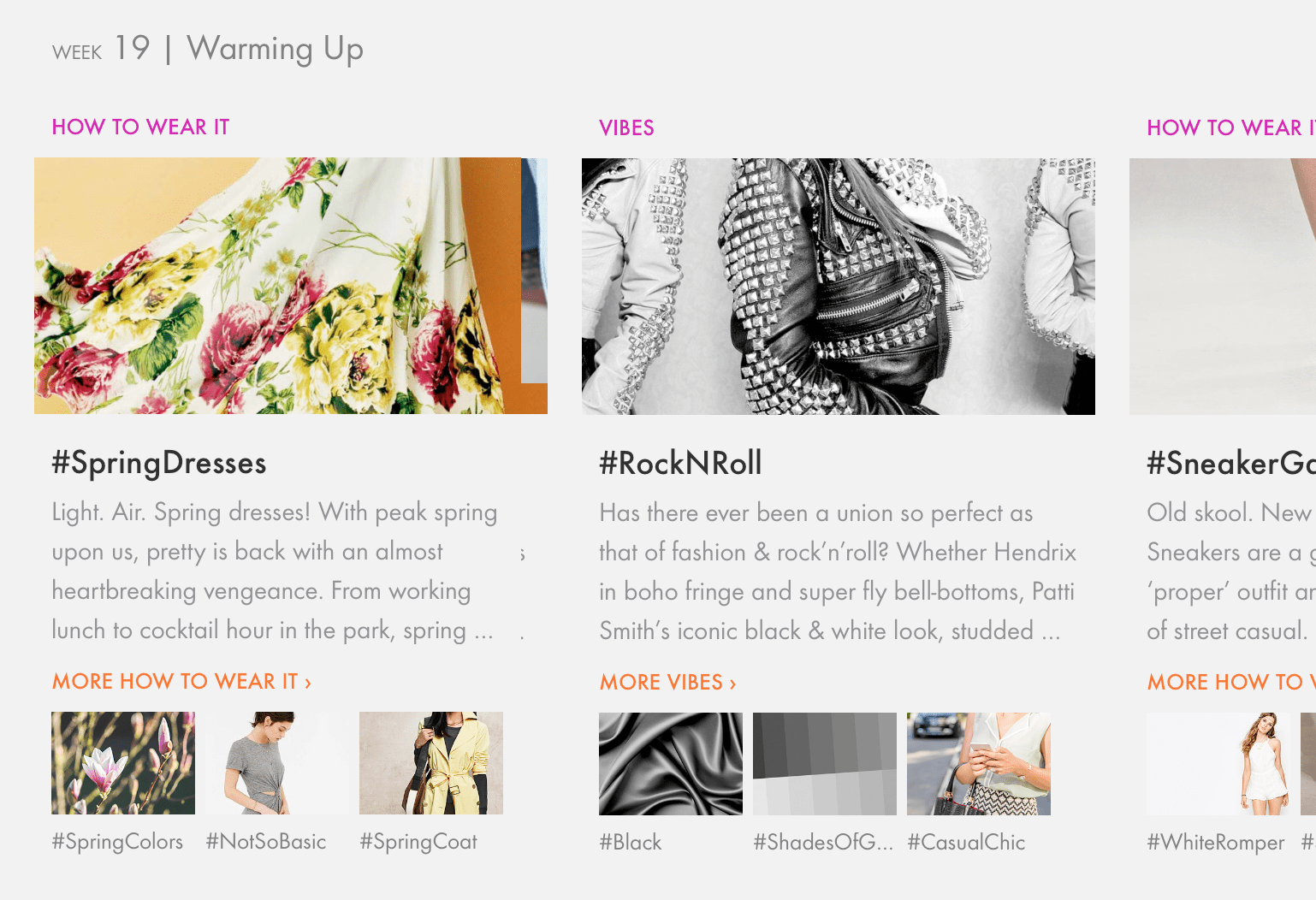
While digital channels may offer us an overwhelming array options in the endless aisles of our consumption-fueled economy, those same technologies can also serve as the means by which we comprehend that bounty, and harness it for our own expressive ends.
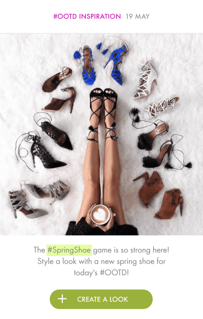
We created Cult Collection as a community for collective creativity—enabling the fashion-forward consumer to define their evolving style by playing the digital version of dress-up.
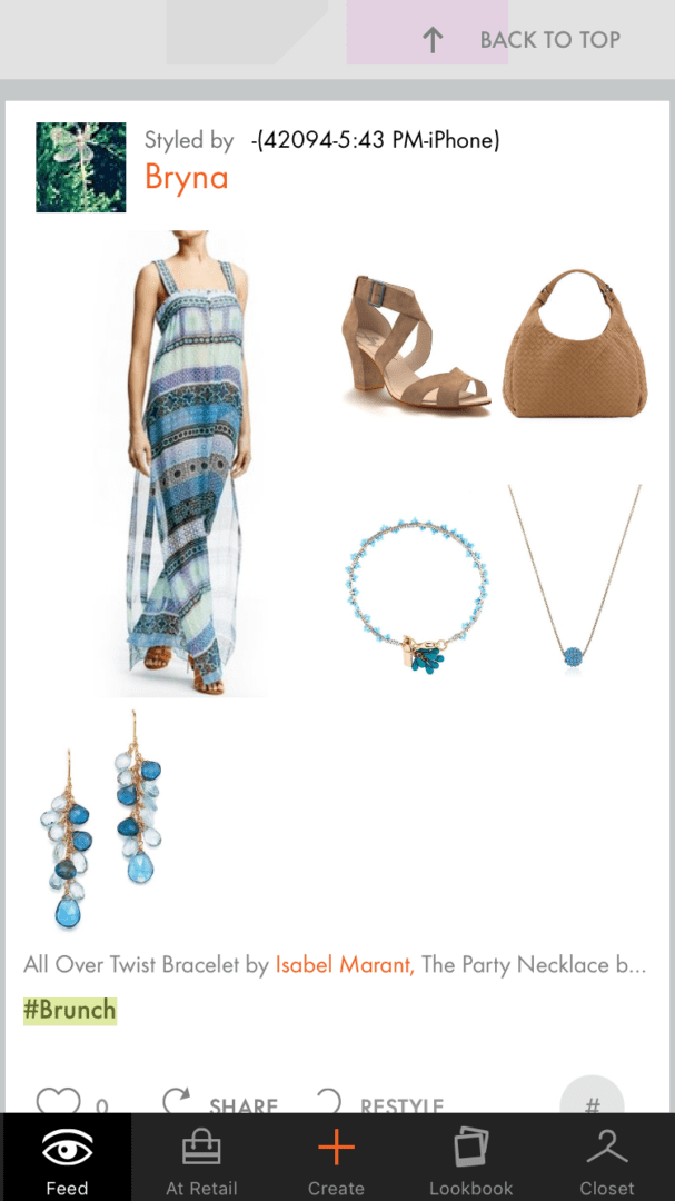
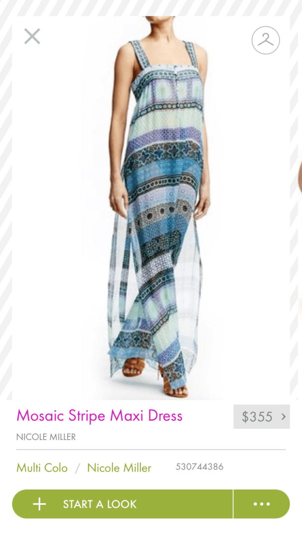
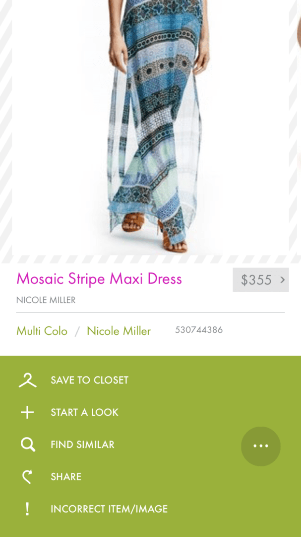
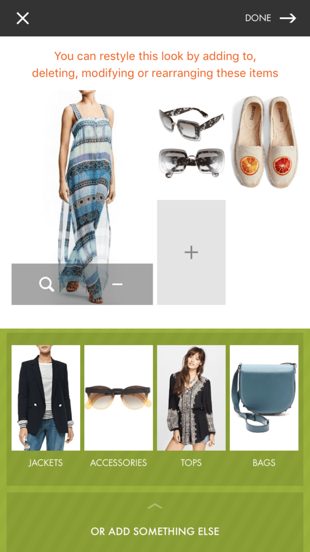
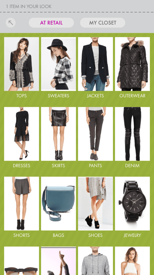
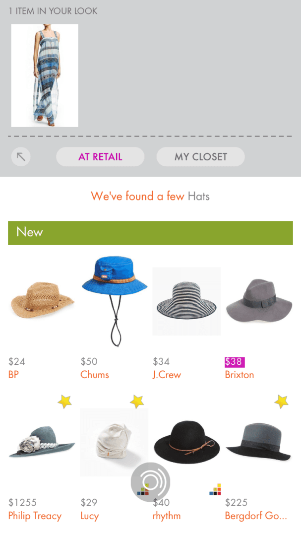
The app allowed them to discover new items at retail, to be inspired by looks created by the community, and to explore how to style items by creating their own looks from scratch or restyling a look by which they were inspired.
The key innovation in the interaction was the simultaneous presentation of both the in-progress look, and points of reference from which the customer was drawing inspiration and making selections—retail inventory, their closet, another look, etc.—bridging the gap between the actual and the possible by bringing each cognitive space into the context of the other.
b2b SaaS /
OpenTable
Restaurant Solutions
OpenTable Restaurant Solutions
2015 / Experience Strategy
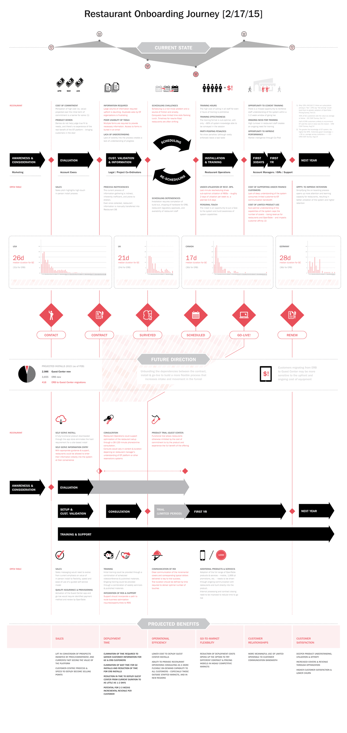
Leveraging the simplicity of consumer technology to expedite product trial, to smooth adoption, and to improve learning, utilization, and retention of the “Guest Center”
The adoption of consumer technologies into restaurant operations offered a step up in ease & efficiency for floor management, and also created the opportunity to restructure OpenTable’s restaurant acquisition & onboarding process.
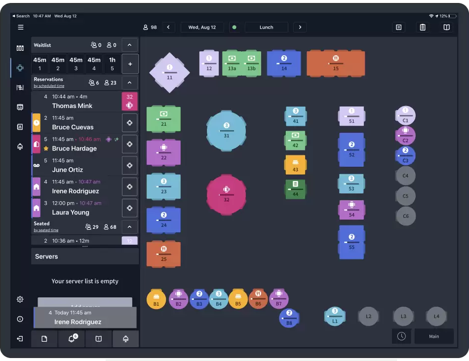
Simpler, faster, and lower-cost system deployment allowed for greater flexibility in customer acquisition strategies, improved the timeliness & effectiveness of product on-boarding, and enhanced productivity for restaurant staff—all of which significantly improved customer satisfaction at the inception of the relationship.
fast-casual flavor /
fast-casual flavor /
Coca-Cola Freestyle
2008-09 / Experience Design
Enhancing the classic soft drink pouring experience for an entertainment-oriented generation through variety & choice
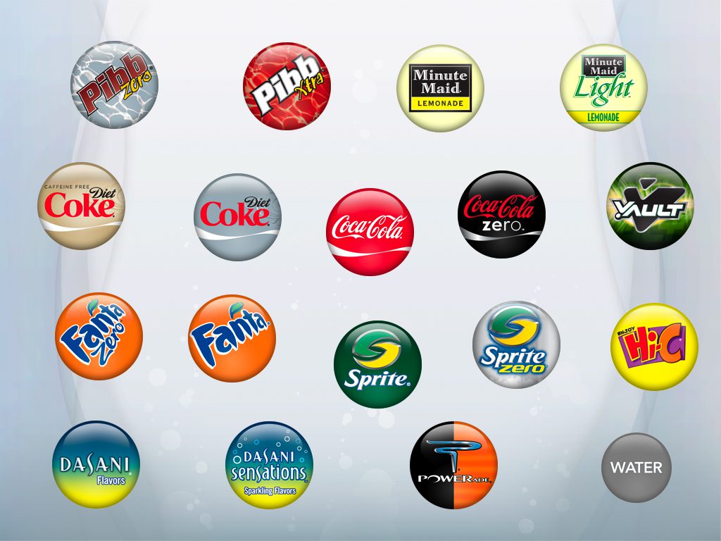
A next-generation interactive fountain dispenser using micro-dosing technology to pour a 100+ sparkling & still beverage brands from a single freestanding unit – delivering unprecedented beverage variety with choices to suit any consumer taste, fine-grained business intelligence, and a reduced environmental footprint.
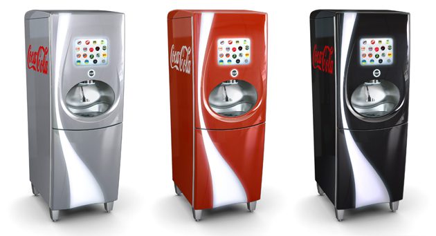
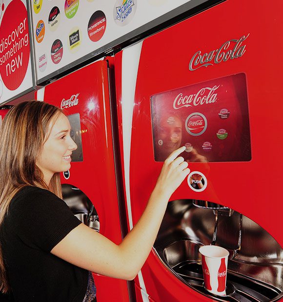
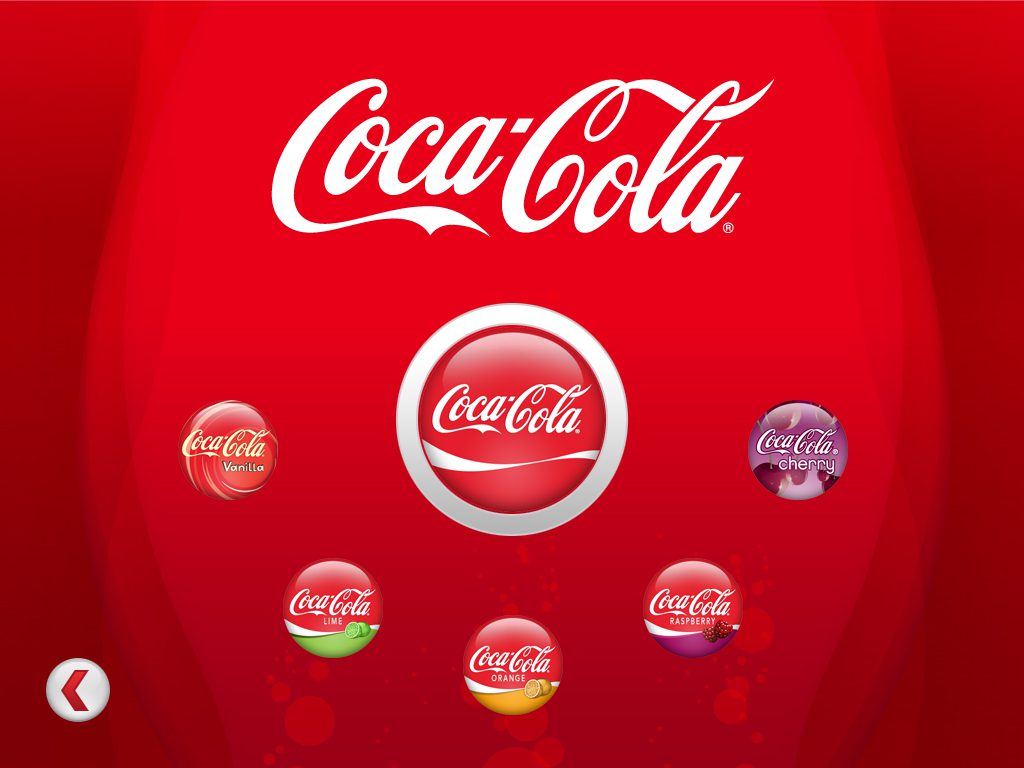
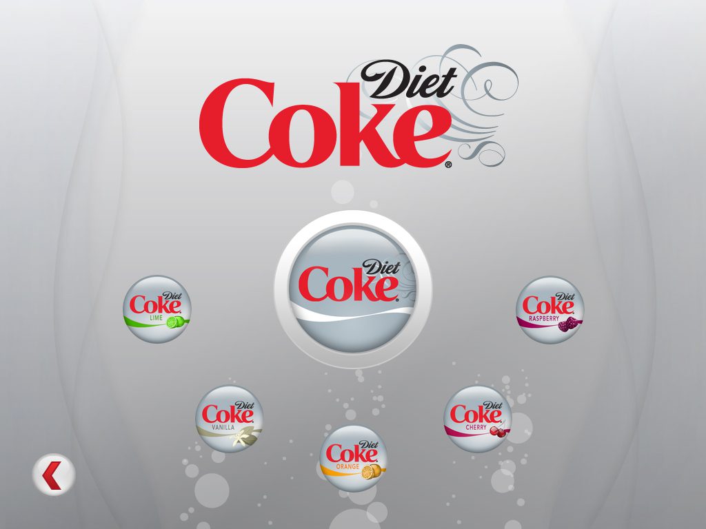
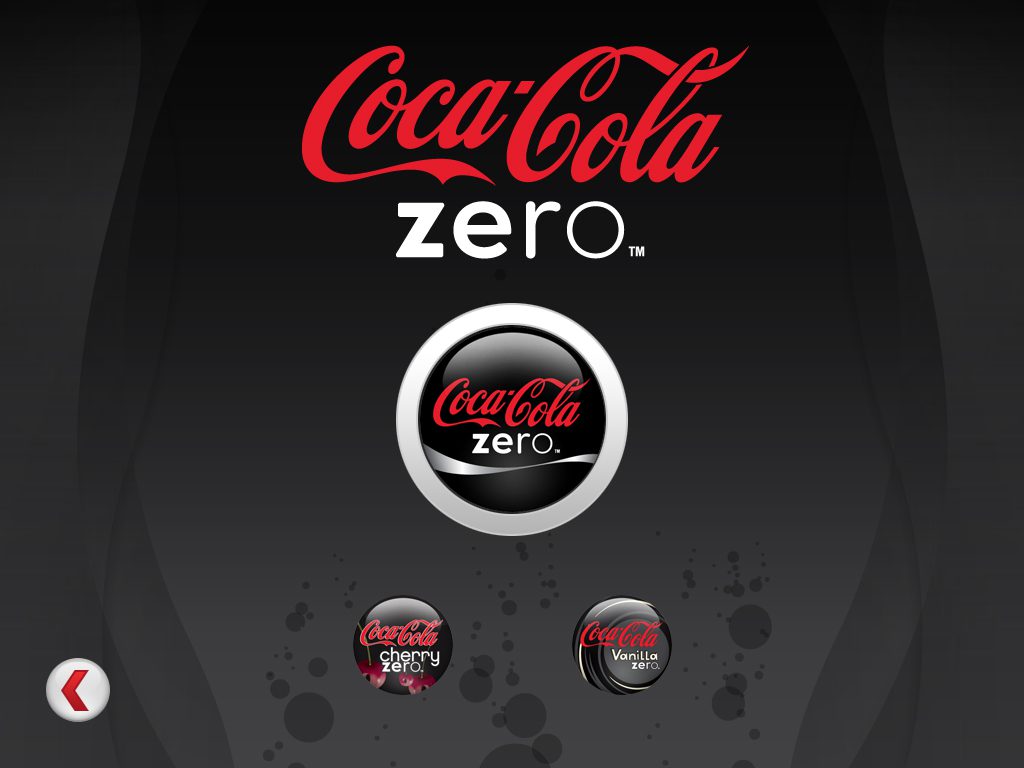
The key design challenge for the user interface was to present the variety of beverages available in a way that made the experience of selecting one intuitive, delightful, and immersive in the aura of the brands offered.
The design of the system integrates the behavior of the touch screen user interface, the lighting scheme, and the mechanical pouring elements into a seamless whole that eases the consumer into a new interaction paradigm for dispensing a beverage.

TOUCH SCREEN
CONSUMER INTERFACE
__
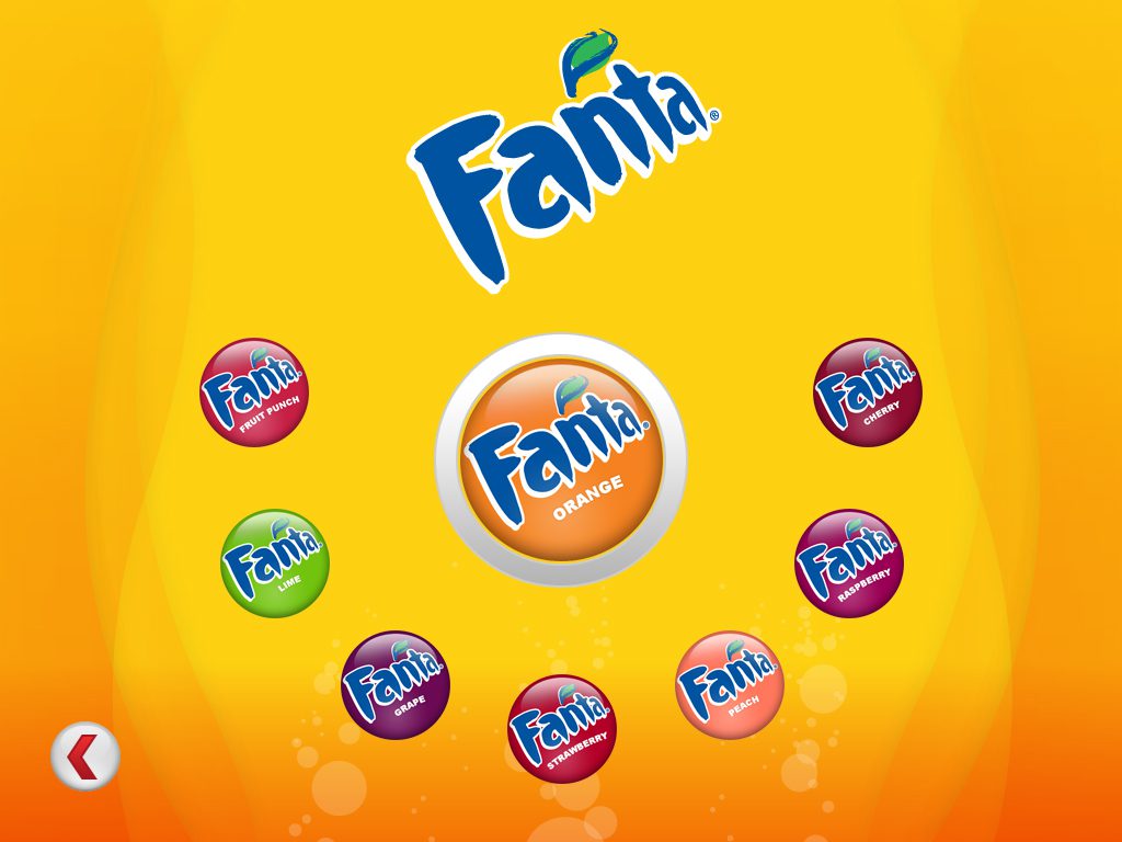
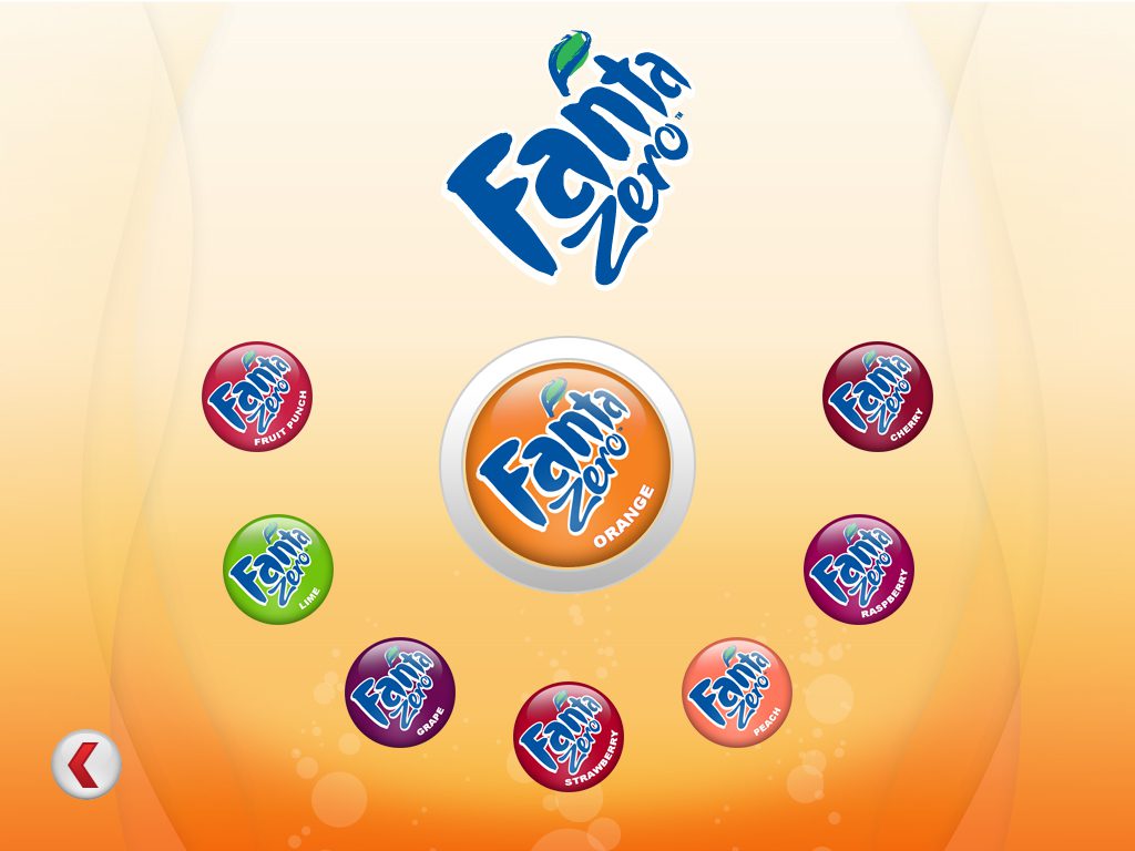
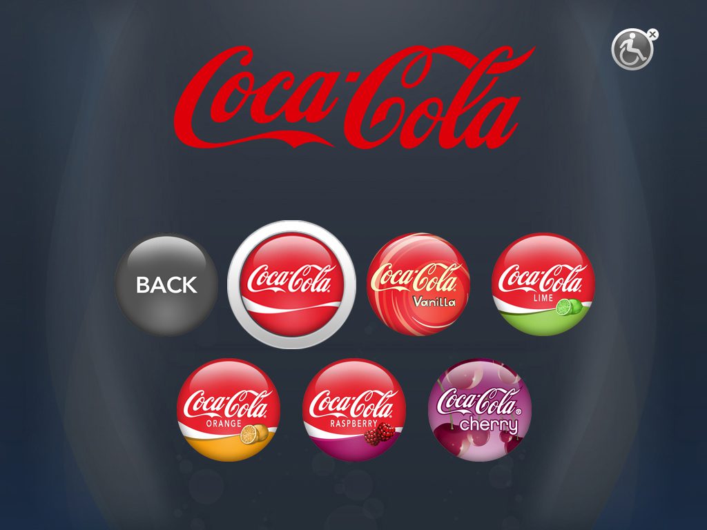
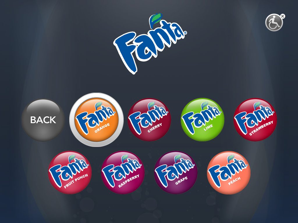
The first generation of the main consumer interface anchored the flavor variants off the brands with which customers were already familiar.
The visual design maximizes the use of the color spectrum associated with each brand, and as the consumer pours their choice of beverage, the color projected from the screen casts a glow on their face, subtly incorporating them into the world of the brand.
ADA
CONSUMER INTERFACE
__
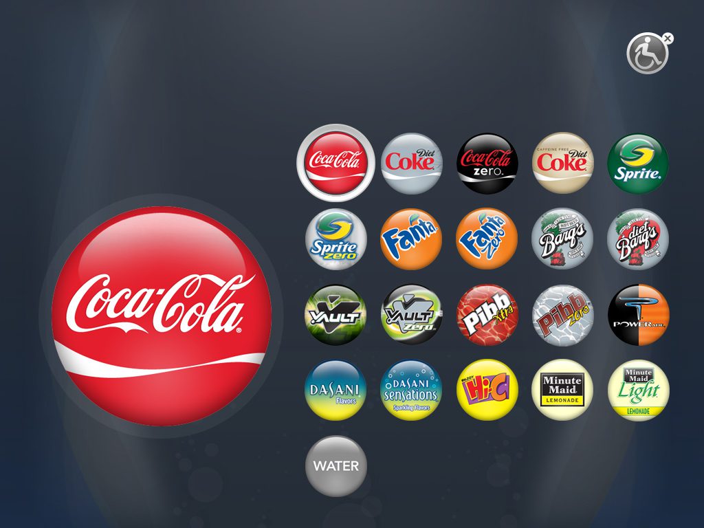
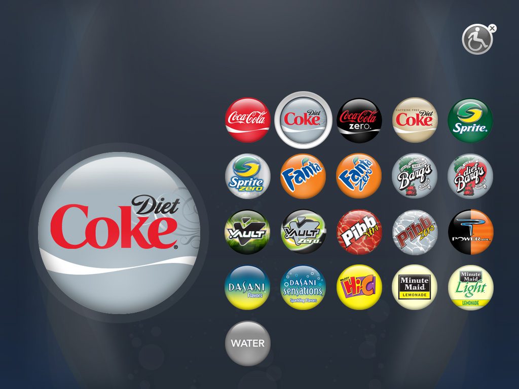
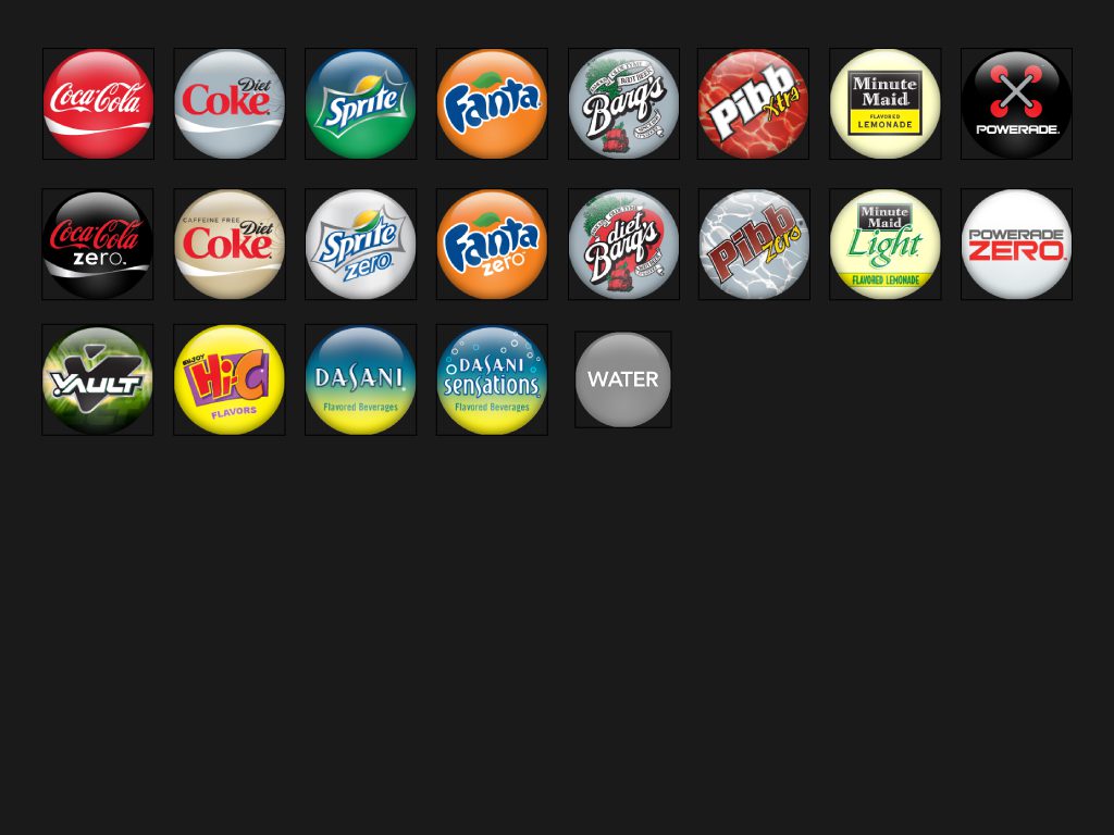
The ADA user interface organizes the same assets in a grid which makes it easy to select a brand and then a flavor using a simple left/right touch panel at an accessible height. The visual presentation is dialed back in order to emphasize visibility and legibility.
CREW-SERVE
INTERFACE
__
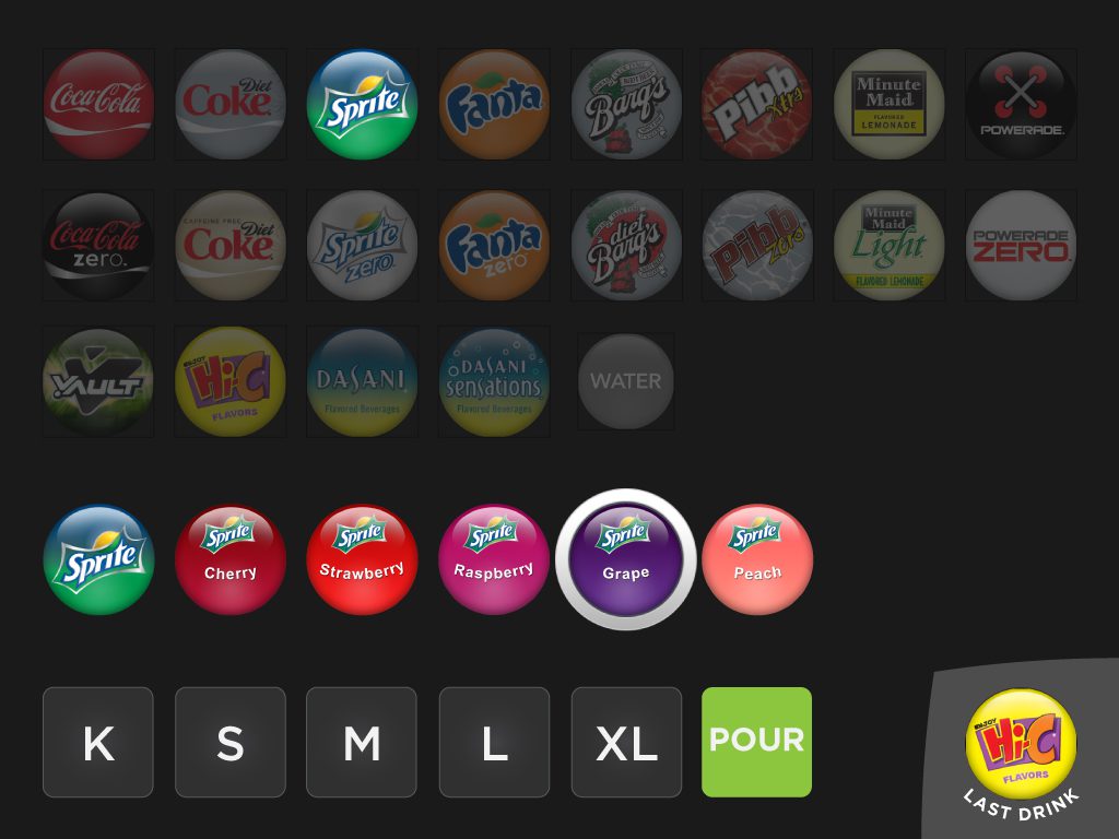
The crew serve interface was optimized for multi-order taskflows, repeat pours, and efficiency of use.
energy education /
energy education /
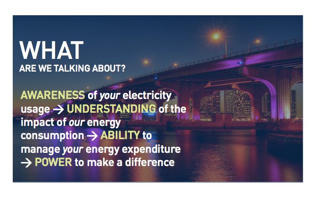
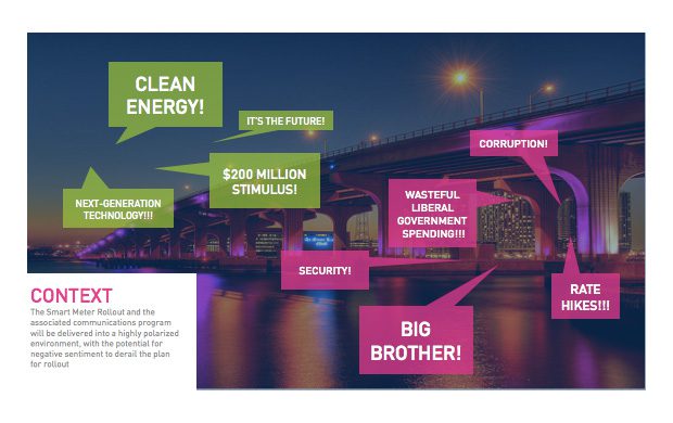
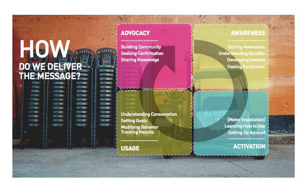
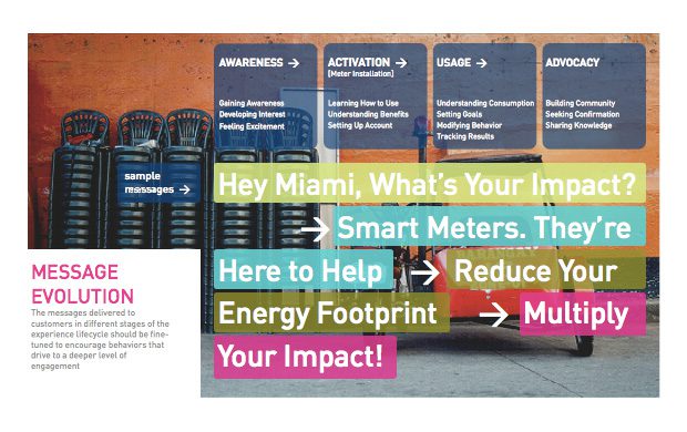
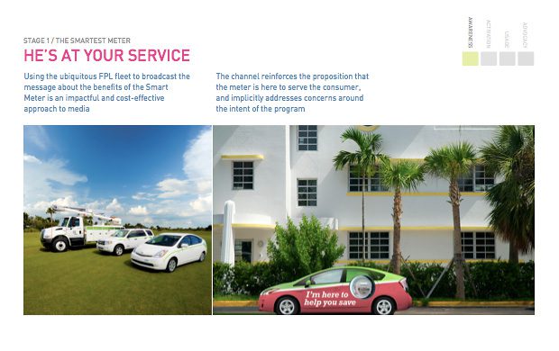
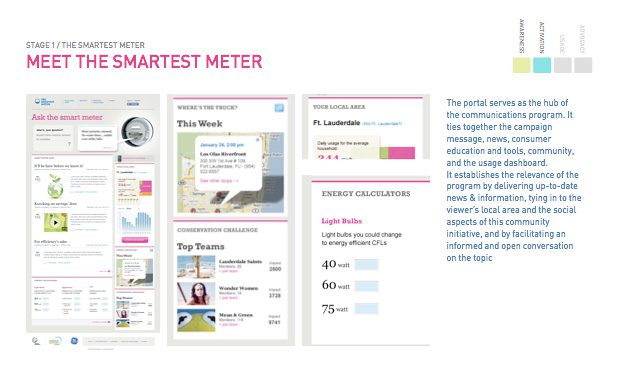
Smart Grid Rollout
2009 / Campaign Strategy, Experience Design
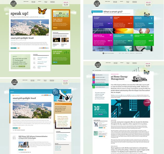
“It's Your Smart Grid”
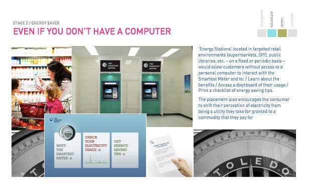
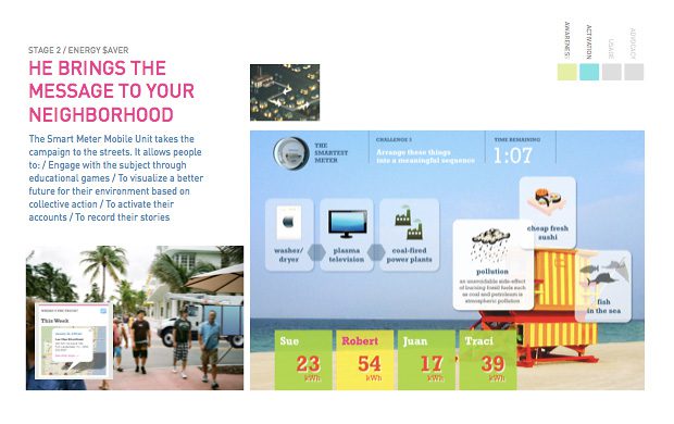
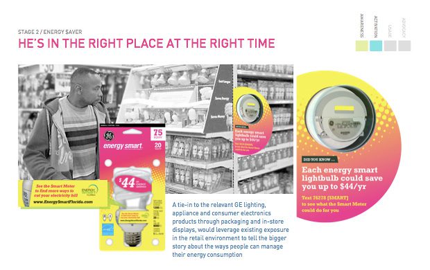
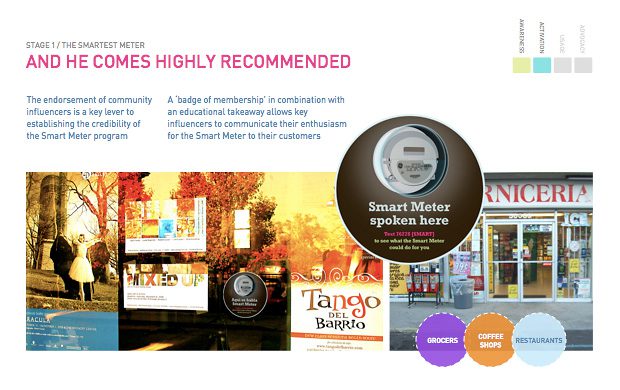
GE Energy needed a communications program to educate consumers on next-generation smart grid technologies, create communities of interest around the relevant energy issues, engage these communities with their local utility providers and regulators, and thereby facilitate the consensus required for the implementation of smart grid initiatives.
fashion retail /
Prada
Epicenter NY
2001-02 / Experience Design, Content Process Development
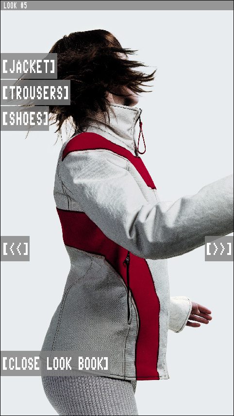
“Prada is Content”
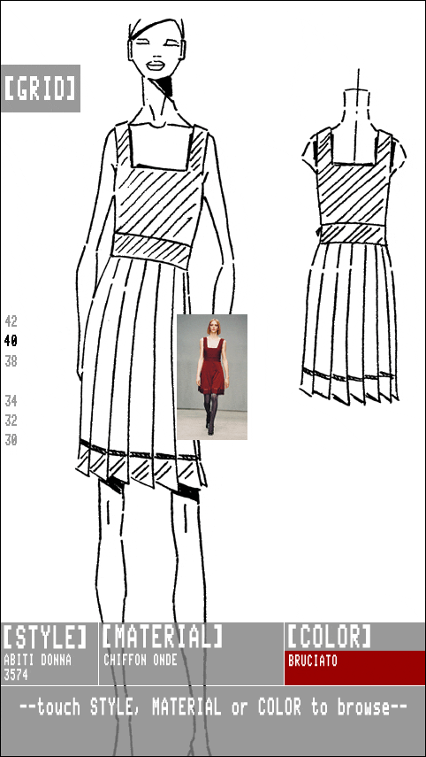
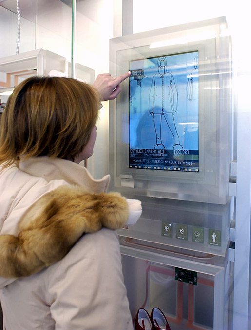
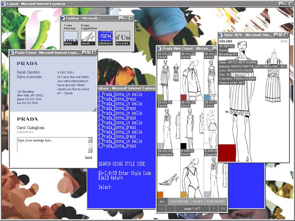
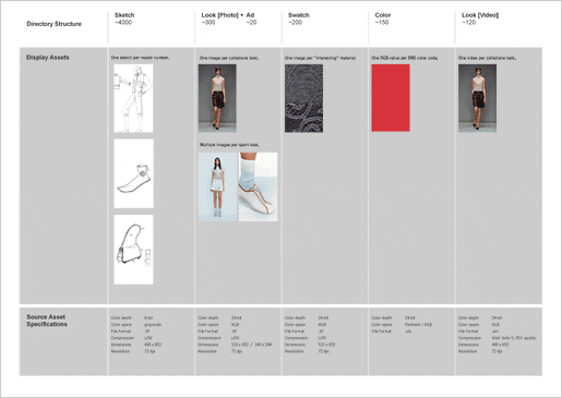
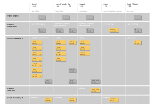
A seminal deployment of multi-channel retail—long before we even called it that—enabling the brand to express its high-touch style of customer service across all touch points in the shopping experience.
HOLLER AT ME


