
Pimp My Spotify
2018 / Strategy & Design
This is an exercise in speculative design to explore potential enhancements to the Spotify listening experience. The first round of work focuses on content architecture, navigation and discovery. This material was originally published on Medium.
Opportunity
+
As the world’s favorite streaming music service, Spotify has developed an enviable set of capabilities — both manual and automated — to open up the seemingly infinite digital music catalog, to facilitate listeners discovering new music, and to drive listener engagement and satisfaction.

SCALE OF CATALOG
Let us not forget just how magical it is to be able to access some significant fraction of the world’s recorded music almost anywhere, at anytime

DATA FLYWHEEL
The scale of the audience coupled with the ability to mine behavioral data for individual and cultural insights – e.g. ‘Take a page from the 3,445 people who streamed the “Boozy Brunch” playlist on a Wednesday this year’ – portends interesting developments in product capabilities

ALGORITHMIC DISCOVERY
The runaway success of Your Discover Weekly and Your Release Radar attest to the hunger for discovery
-
But in this effort it also remains hampered by a set of issues including:
DESIGN PATTERNS
Design patterns that don’t make for the most fluid — let alone delightful — listener experience

CONTENT CURATION
Content curation strategies that don’t celebrate the richness of the catalog or the diversity of individual taste

ACTIVE EXPLORATION
An under-emphasis on features that would allow the listener to really explore the long-tail of the catalog and build affinity through personal narratives of discovery
Proposals
In this round of analysis and exploration, I take on the content architecture, navigation patterns, the problem of discovery, and the challenge of just getting started. To summarize the subject matter below, I explore the following topics:

CONTENT ARCHITECTURE
A restructured content architecture that caters more intuitively to the listener’s varying dispositions with respect to familiarity vs. novelty of what they choose to listen to

OFFLINE EXPERIENCE
Better support for an Offline Mode to view and manage downloaded music

QUICK-START PREVIEW
A Preview Mode in which any musical content being viewed is played automatically, making the actual music the driver of a set of informed skip/stay decisions to select what to listen to

CONTENT/TASK NAVIGATION
Adjustments to the UI to reduce friction in navigation across and up the catalog hierarchy, and between the screens supporting different modes of interaction — Browsing, Now Playing, and Up Next

UBIQUITOUS RADIO
Better integration of Radio into the play options for any node where it’s applicable — playlists, songs, albums, artists and genres/moods
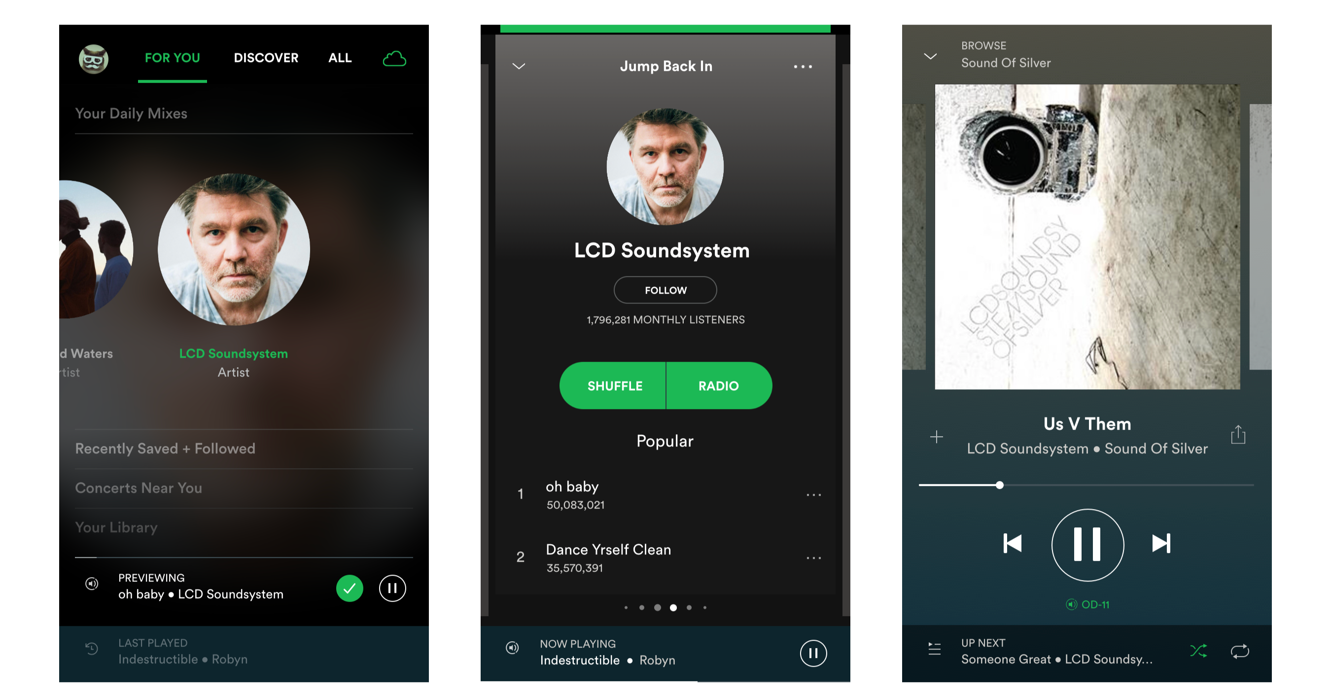
Catalog Structure 1 – Content Architecture
Like any mature platform in this age of category-killers, Spotify has the enviable problem of having developed a lot of features to cater to many different needs & desires.
But there’s just too much of it! Aaaaargh! A little bit of something for everybody, but repeated everywhere, and scattered all over the place.
The current structure suffers from gotta-also-have-it-there duplication, missed opportunities for rationalization & consolidation, and an unnecessary depth that buries some of the most promising material (hello Discover, where are you?)
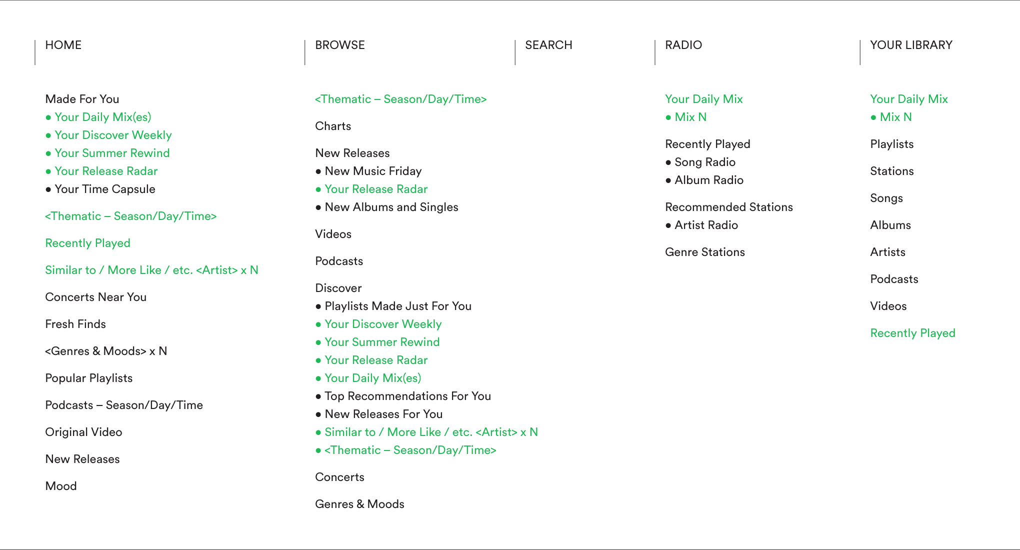
The current structure is not organized according to clear principles, and is riddled with duplicates
A quick look at the current structure reveals the following opportunites:
Browse could be rationalized and integrated with Home.
Discover being buried under Browse is the biggest lost opportunity to leverage the power of data to increase the listener’s exposure to music they don’t yet know but could love. Upgrade now please!
Search hangs out at the top level, but applies only to online content (try it in flight mode). Oh, you can also filter the various segments of Your Library as a proxy for offline search, but really? I’m not saying that a consolidated presentation of search results across multiple datasets is easy, but c’mon it’s 2018!
Radio is just a different way of listening, not a doppelganger of the catalog. Better to allow the user to browse a single hierarchy, and then select the way they want to listen.
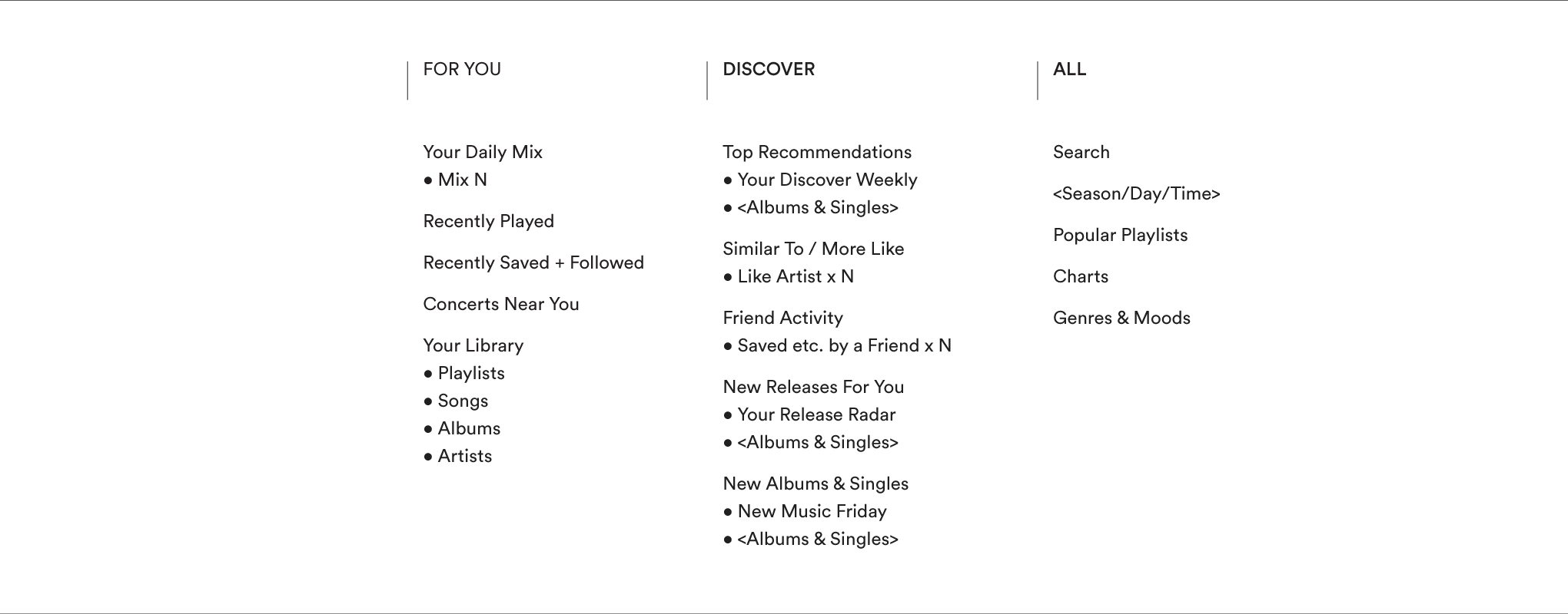
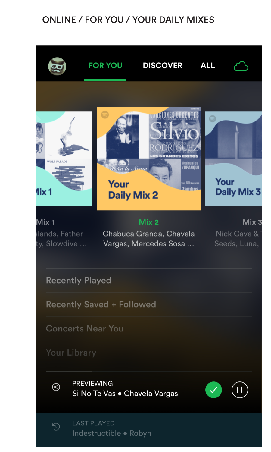
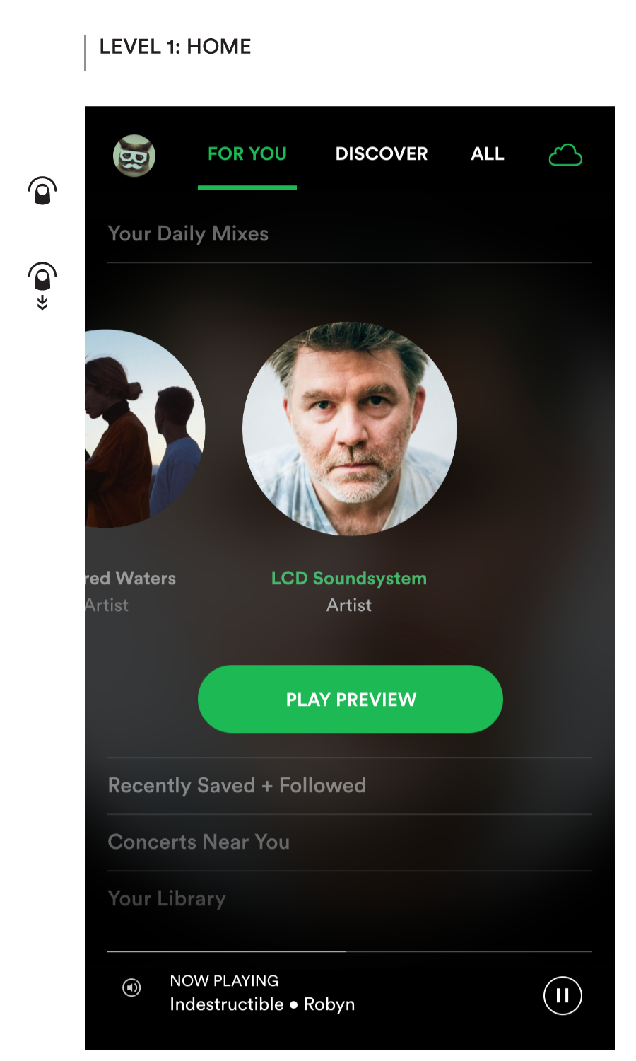
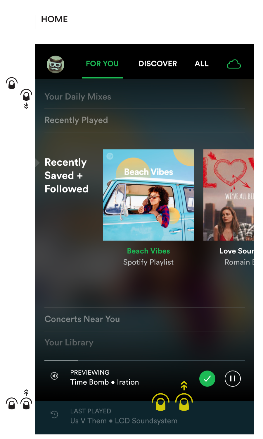
The proposed structure is more compact, predictable, and built around the listener’s knowledge model
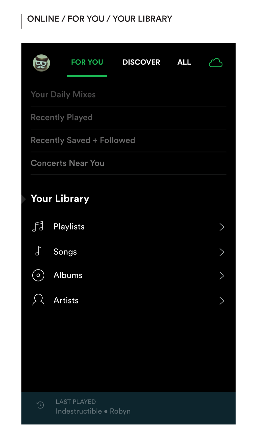
In this model, content known to the listener which directly reflects their activity is grouped under For You.
Discover, which extrapolates from that activity to surface music the listener may not yet know, is elevated to the top level.
And All presents more general ways of listening based on activity across a larger population.
Of course, for a new listener, the All tab would be the most logical starting point (Discover would be limited to New Albums & Singles, and For You would just be Concerts Near You). As they built up a history, more sections would open up.
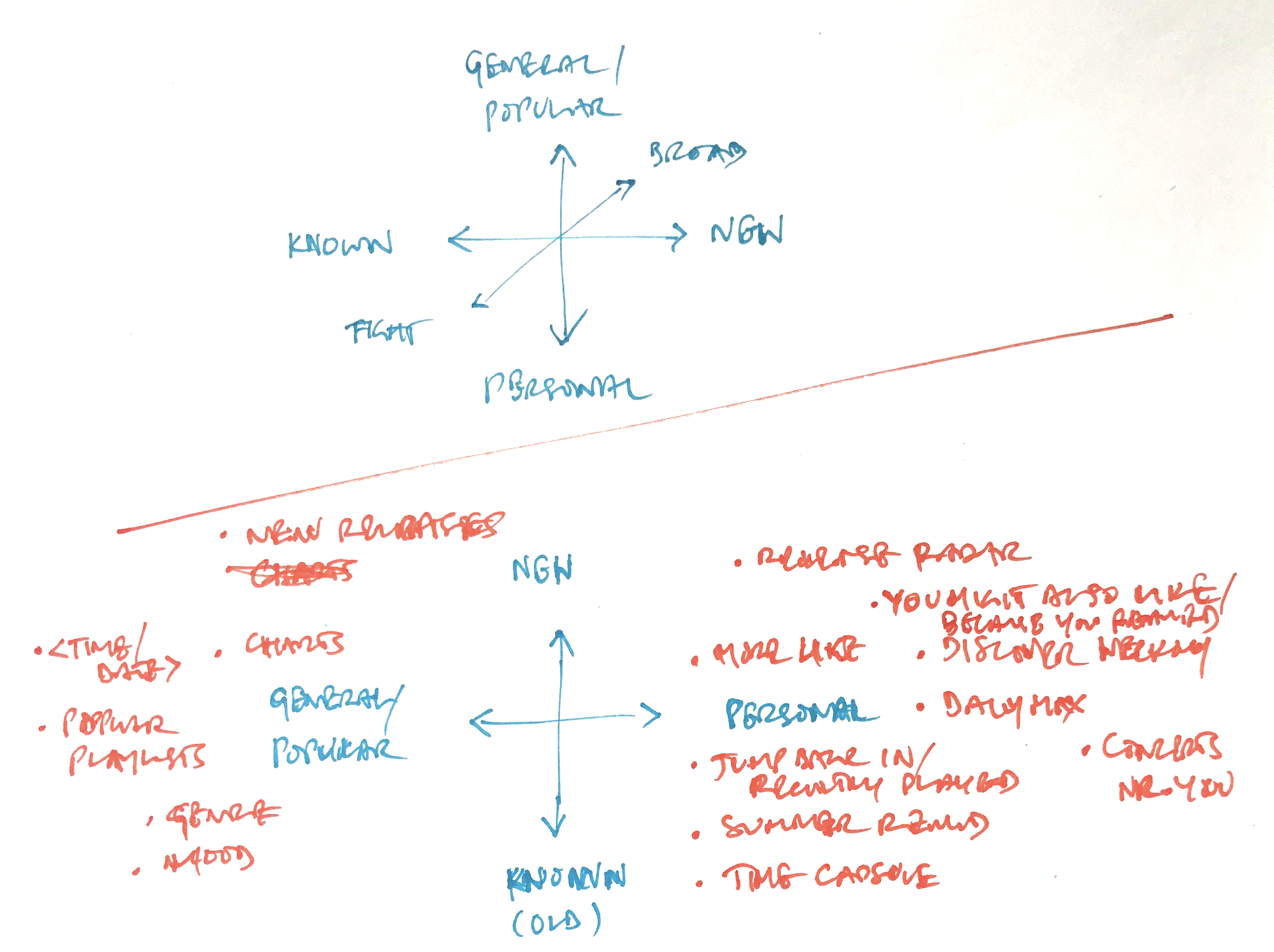
Explorations of primary organizational axes for content
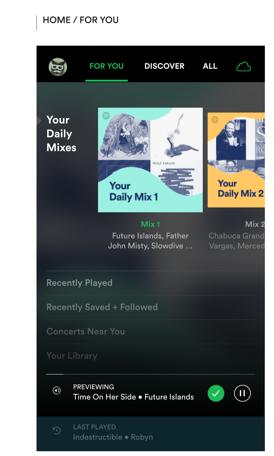
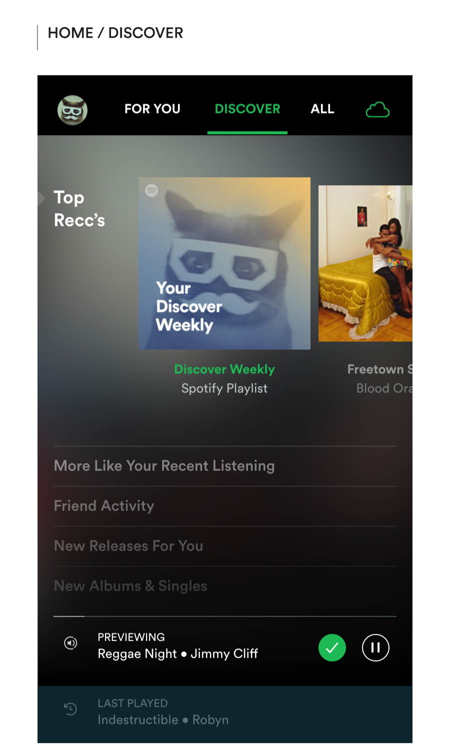
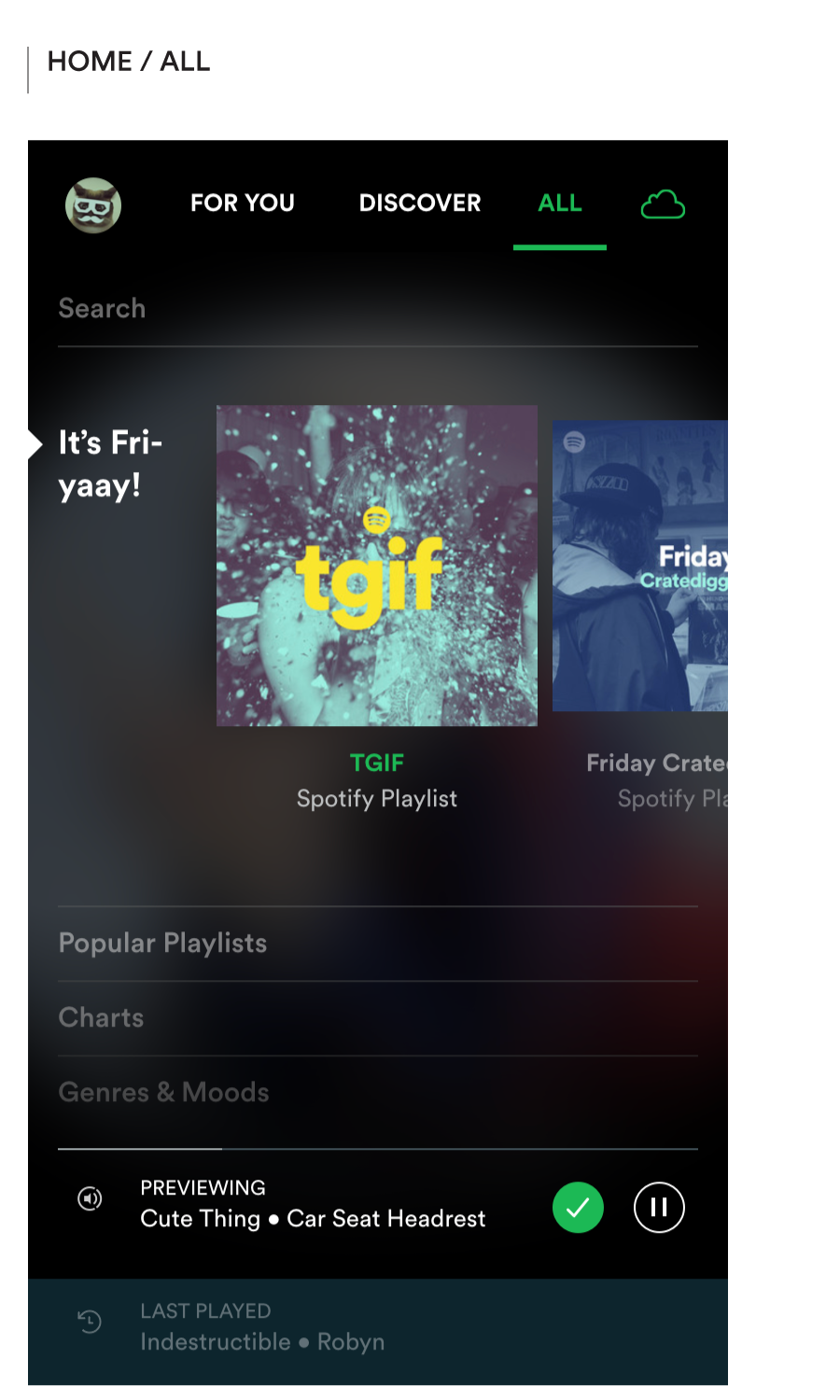
Content categories on the Home screen would be organized across 3 tabs
Catalog Structure 2 – Online vs. Offline
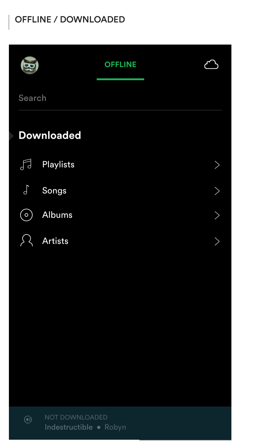
Unaccounted for in the current structure — but crucial to supporting offline use — is an easy way to switch between views of the whole catalog and my downloaded music. Ignoring this need leaves a big hole for Spotify around travel and adventure—flying, hiking, road trips off the beaten path, etc. — i.e., precisely the kinds of experiences where music can really strike a chord.
Amazon has already solved this really well with the Kindle which has a top-level toggle between All and Downloaded, making it a breeze to provision for, and then access my reading in flight mode.
Getting Started
With all that fantastic content to wade through, we’re often left facing the paradox of choice. Sometimes it just feels impossible to make the right selection, because there’s always the possibility of a better option. This of course, is not particular to choosing what you want to listen to on Spotify. It’s the bottomless mimosa problem that plagues all large “content” consumption platforms — whether we’re talking about viewers endlessly squirreling away shows in their Netflix Watchlists, or the poor dating single’s maddening inability to focus on the cutie drinking a martini across from them right now (ahem!). When the supply is endless, the bubbles just don’t feel like champagne any more.
I’m often left wishing for something that feels as immediate and tangible as the ‘dumb’ radio in my car. Actually hearing what the channel has to offer helps me make a split-second skip/stay decision as I flip my way through to find what works for right now. And somehow that seems to be the key—accepting the serendipity and joy of ‘right now’ over the imagined perfection of ‘the right one someday’.
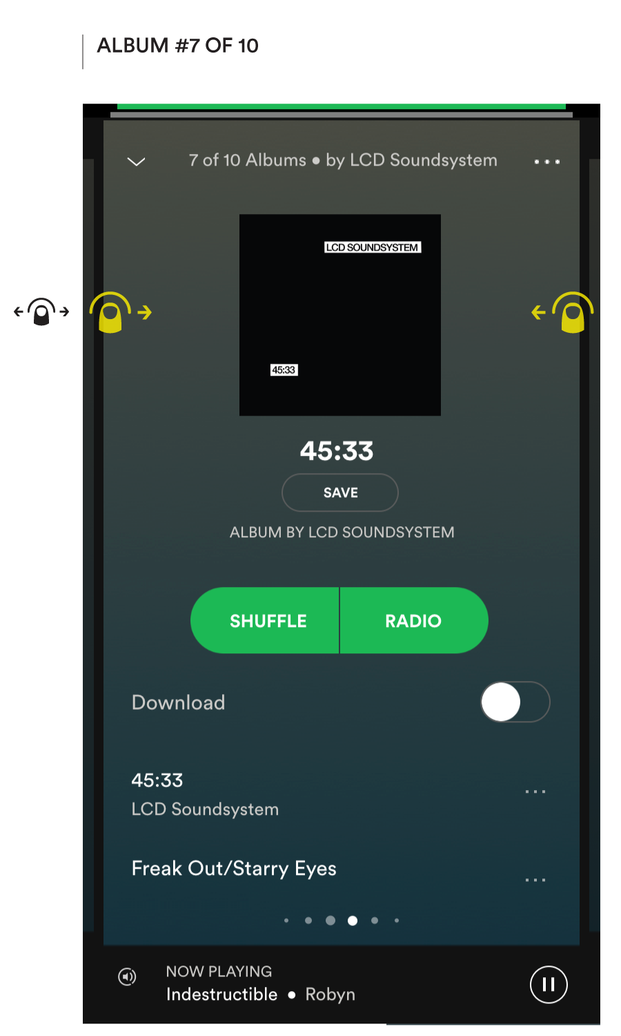
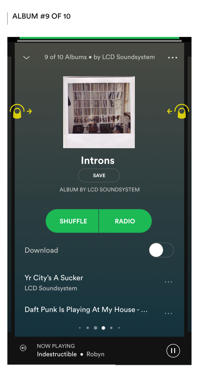
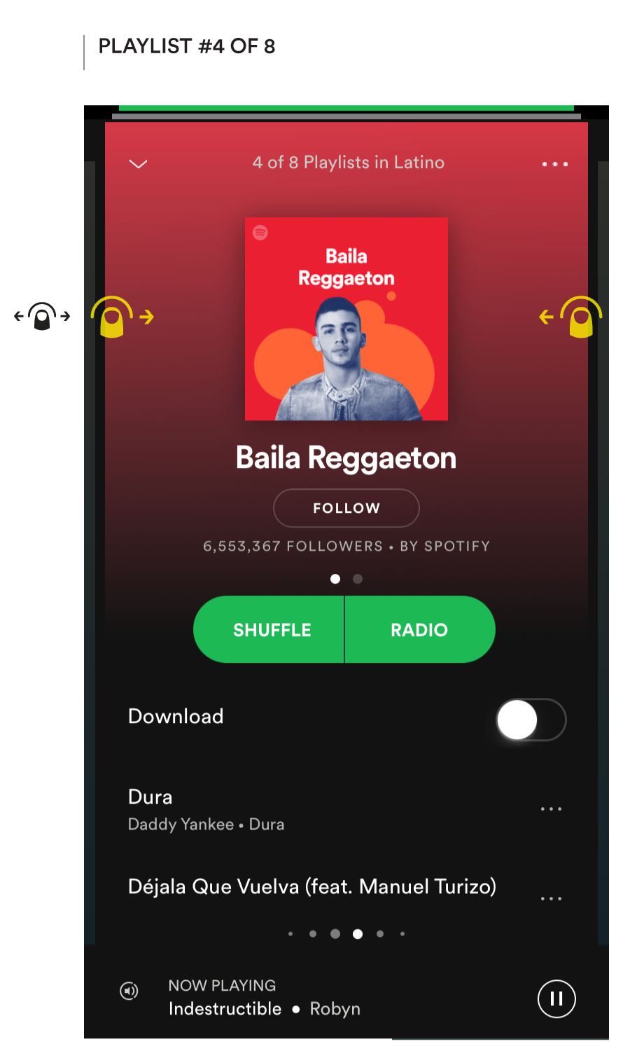
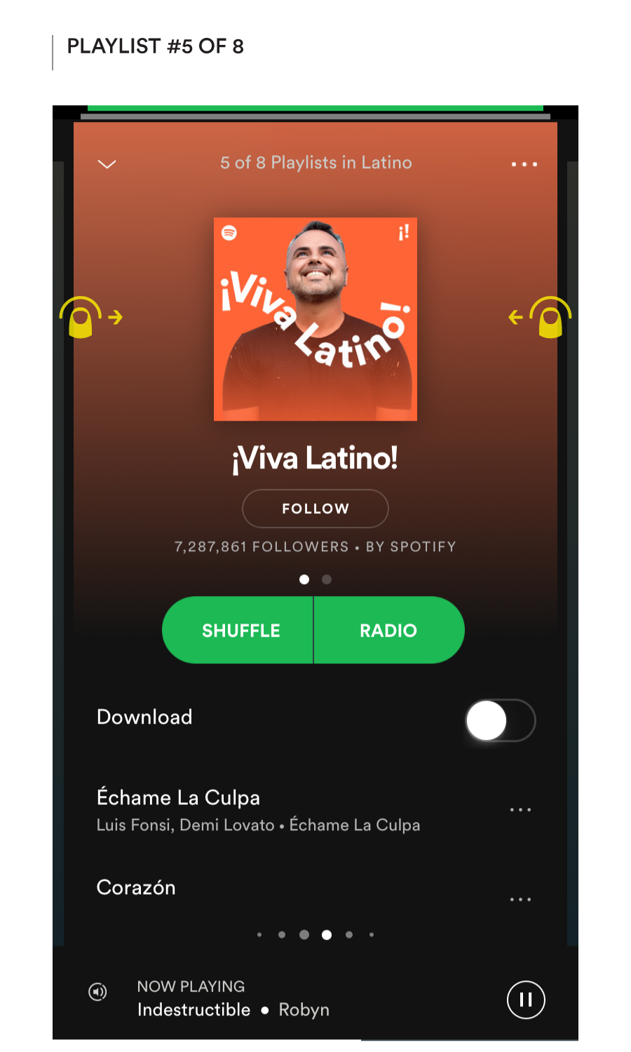
I propose a new way of browsing whereby we automatically start previewing the music in the node currently highlighted (this could be the default behavior of a user setting). This changes the browsing paradigm from scrolling to pagination, and so also the visual presentation of the browse grid. Within each tab, content carousels are laid out within accordion sections, which the listener can flip through.
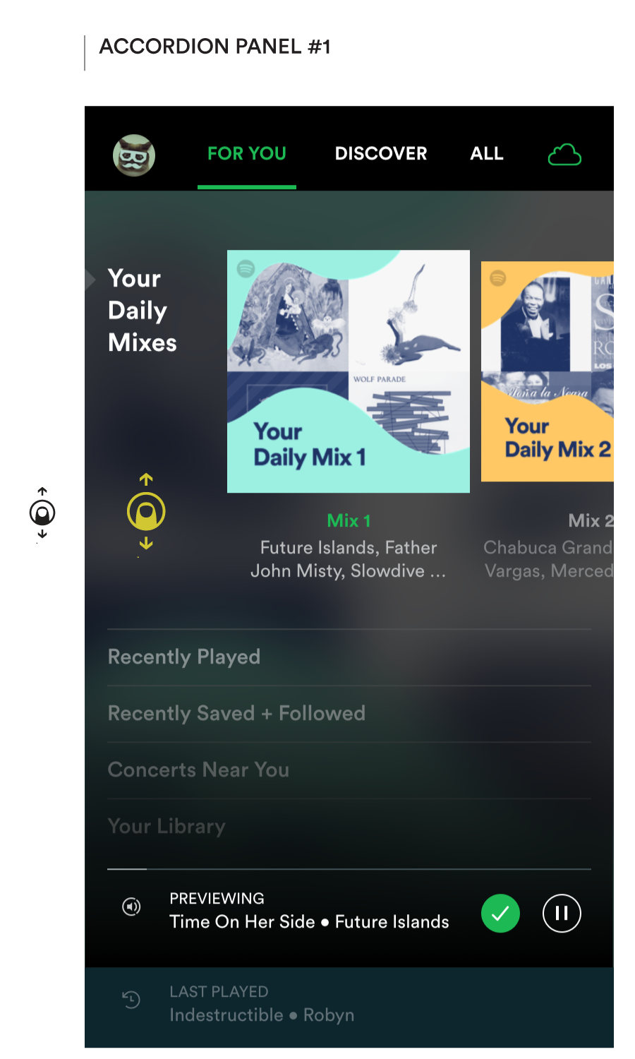
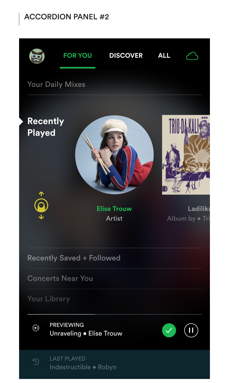
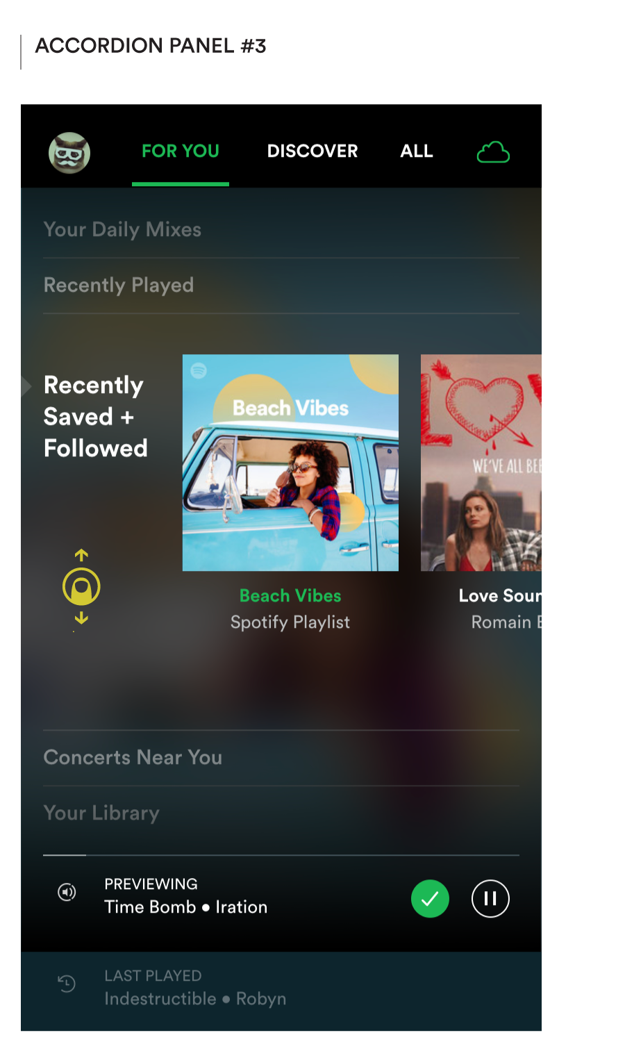
Tap or vertical hold & drag to flip between different content themes
Swiping between the different options within each carousel changes the ‘station’. It promotes focus on the choice at hand, and the appeal of the music (or lack thereof) acts as the forcing function driving a simple yes/no choice, just like it does with that dumb radio, or old-skool TV, or the latest version of the Netflix TV experience.
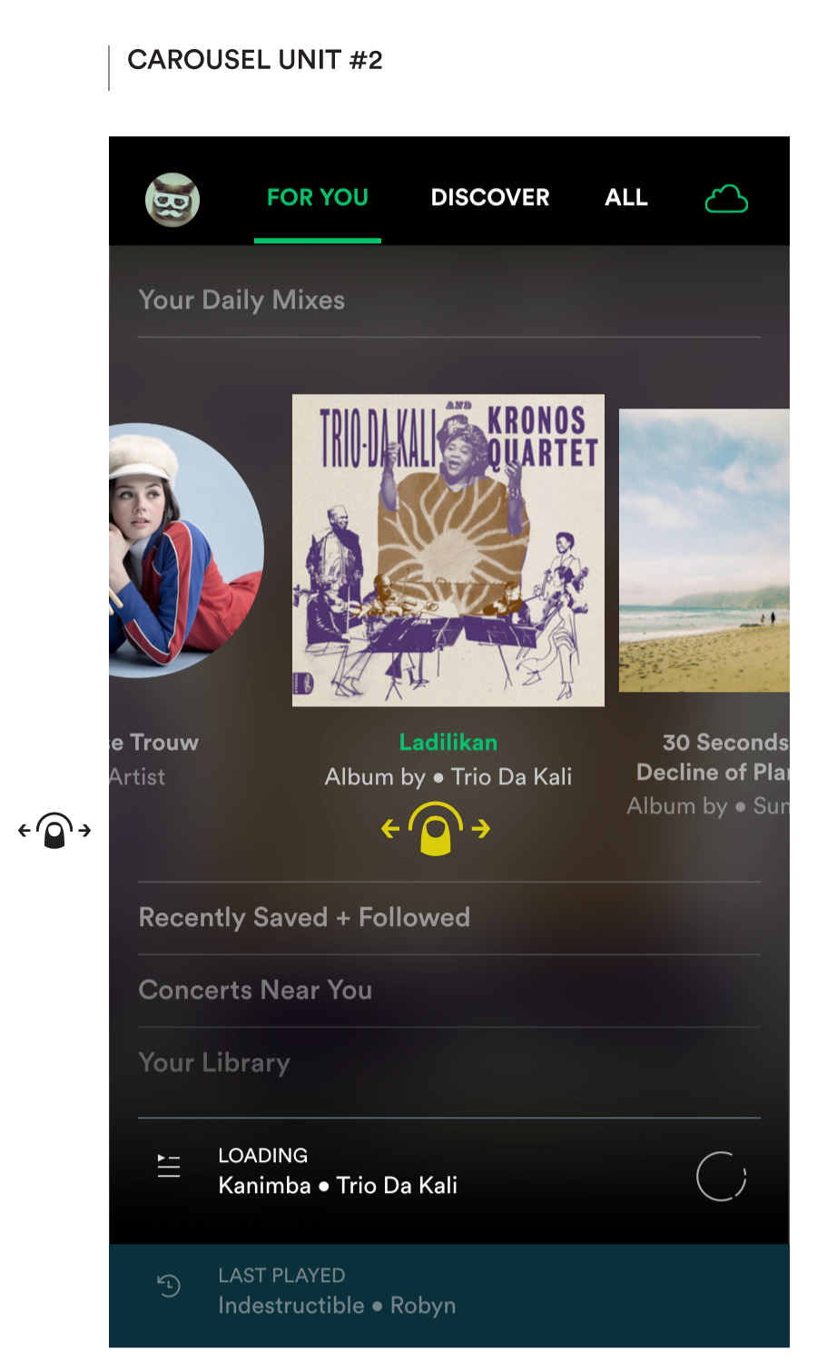
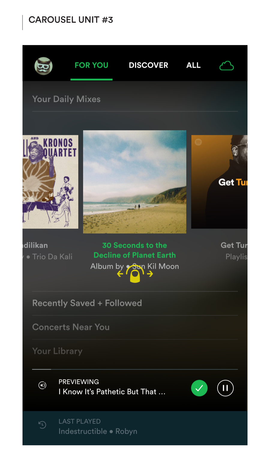
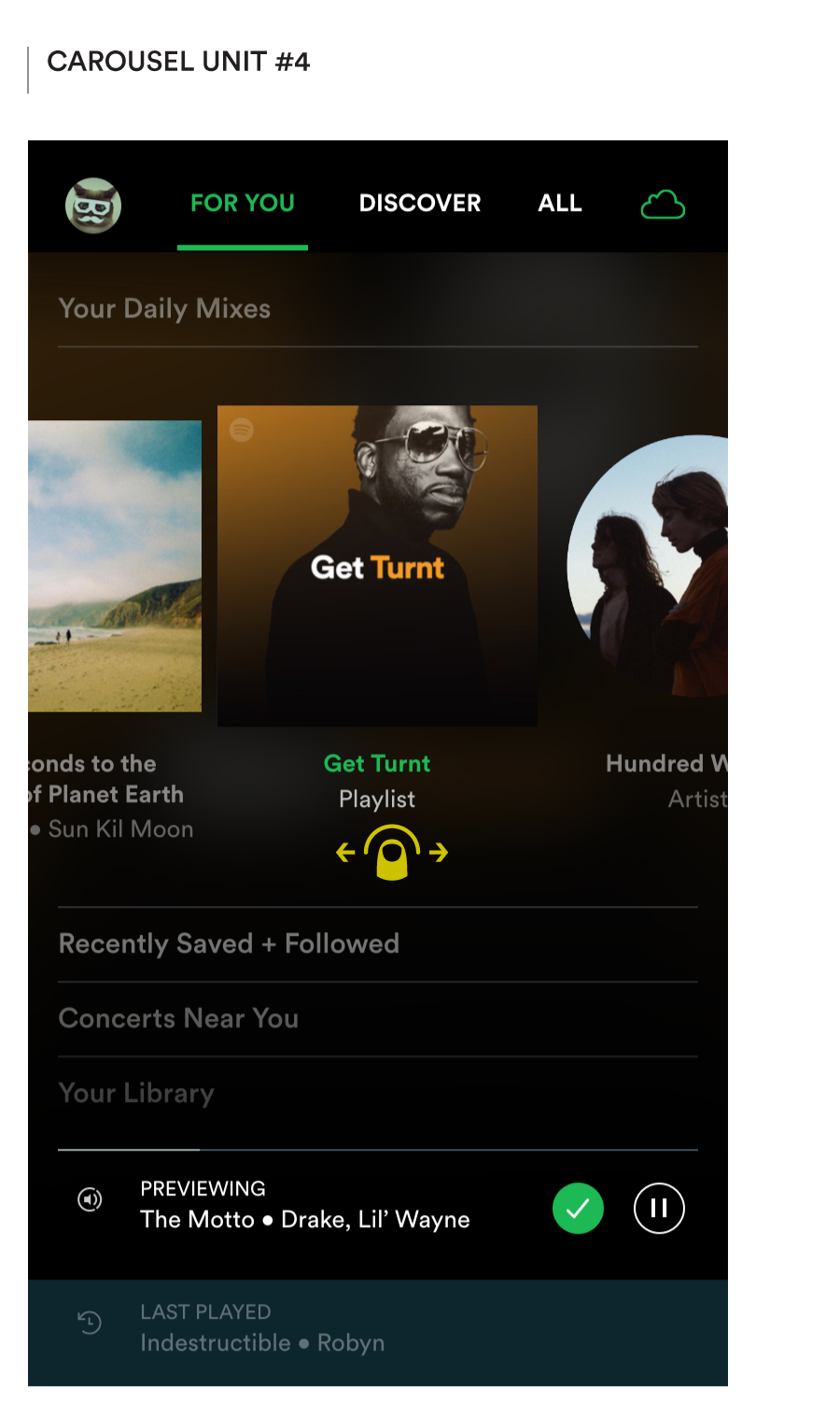
Horizontal swipe to navigate laterally and preview different music options within a content theme
In this paradigm, when the listener chooses to play a new piece of music (album, artist, playlist, whatever)— either by starting the app or by browsing and selecting — the appropriate track would start playing in Preview Mode.
Once initiated, Preview Mode would allow for (1) single-action preview of other music as the listener browses through the catalog, and (2) access to the Last Played track through the bottom row should they wish to go back to what they were hearing.
After a minute of playing in Preview Mode, the system state would switch to Playing, which would continue playing the currently selected music as they browse other options, and require them to explicitly choose to play (preview) any other music they wish to listen to.
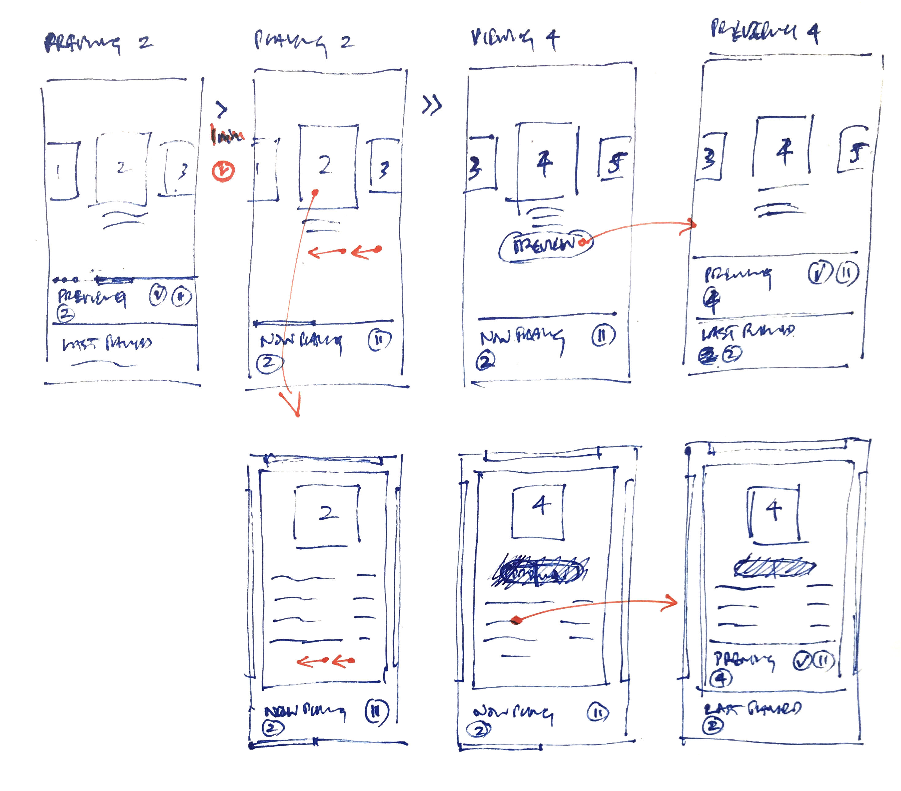
Flow between silent, previewing, and playing states as the user browses content
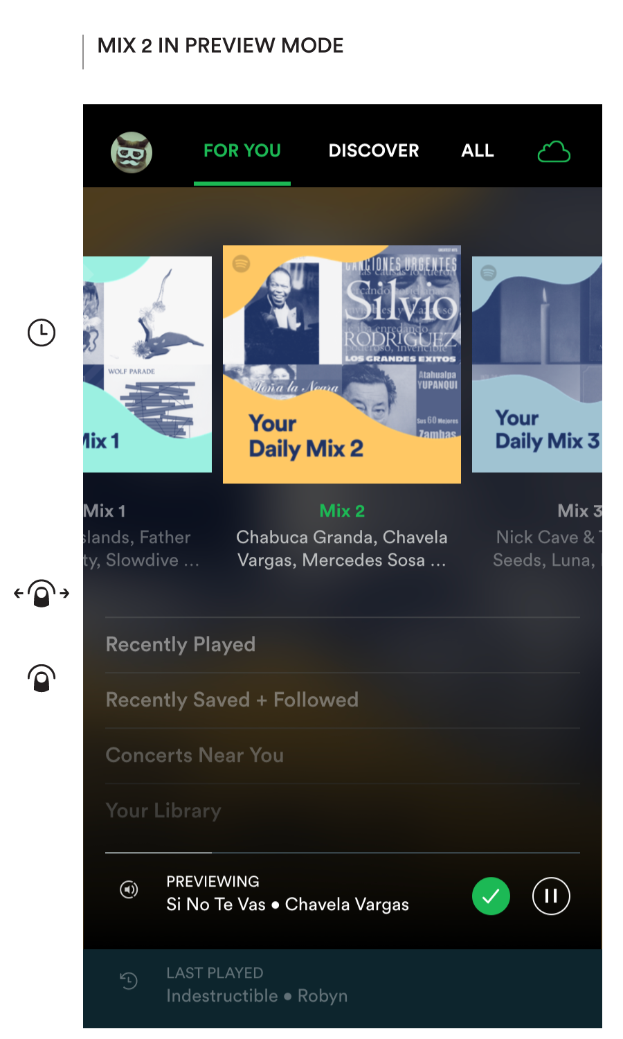
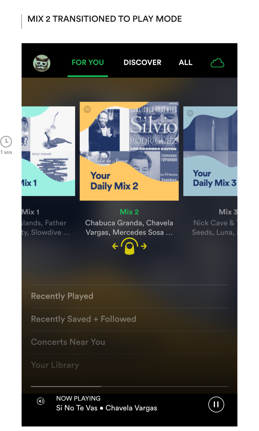
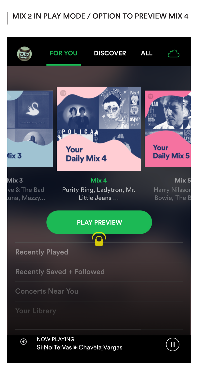
All play starts in Preview Mode, enabling fast switching to previewing other music, and the option to return to the last played track.
After a minute of preview, the system transitions to Play Mode, which keeps playing the current track till another option is explicitly chosen for play/preview
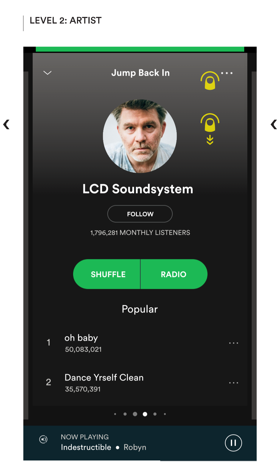
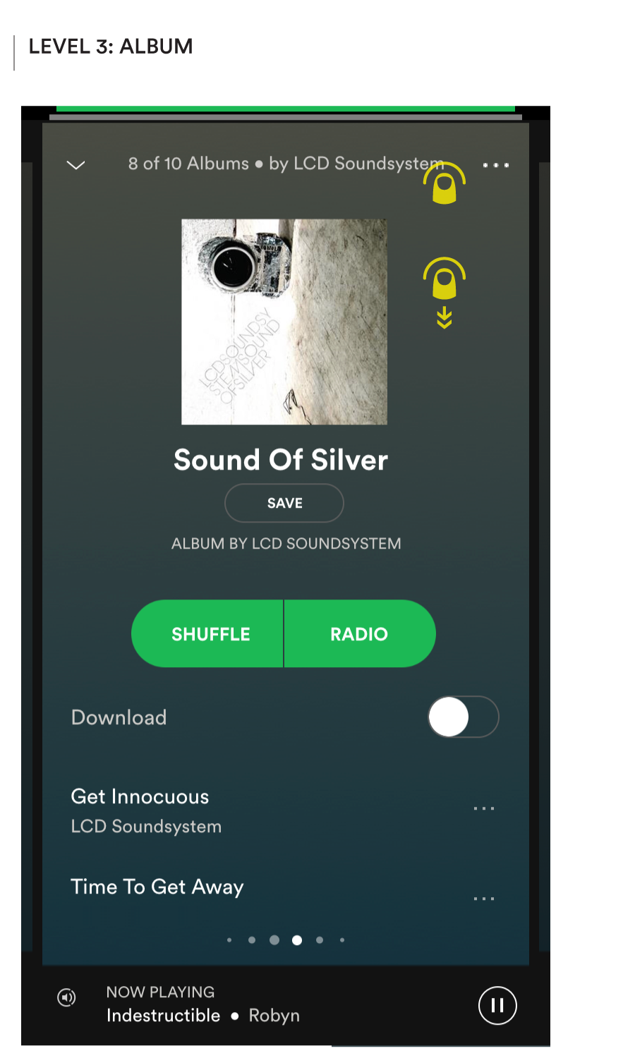
Extending this idea further, Preview Mode could be applied at any level within the hierarchy, e.g. when the listener is viewing an artist, selecting between one of their albums, considering a genre, or picking between playlists in a genre, etc.
Cueing up the music to minimize any delay as the listener flips through stations could be a non-trivial challenge for the less predictable paths, and so the quality of the recommendations becomes even more important to keeping their experience smooth and delightful.
In some ways all this may well feel like a lot of additional complexity in the design system to eliminate one extra click per musical unit while the listener is browsing. But if we’ve learnt anything from the success of Tinder, Snap et al, it should be that eliminating friction from browse mode is critical to delivering a more playful experience, and that play is the path to increased engagement.
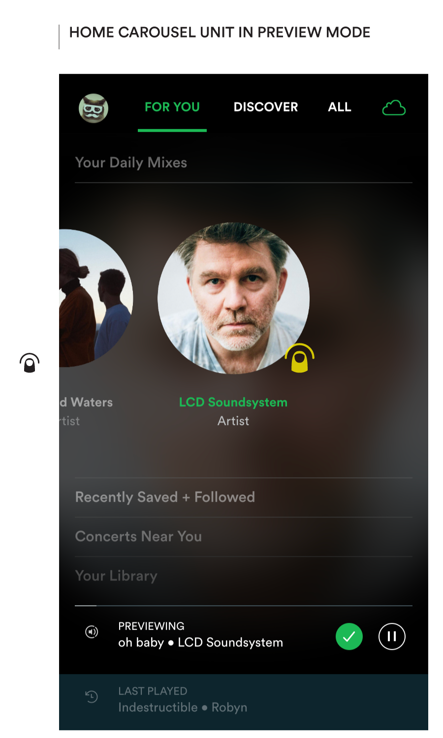
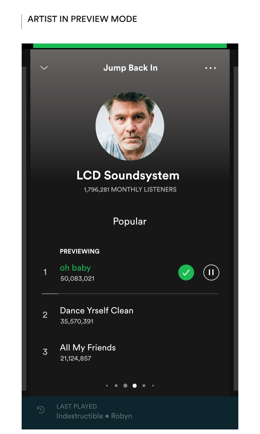
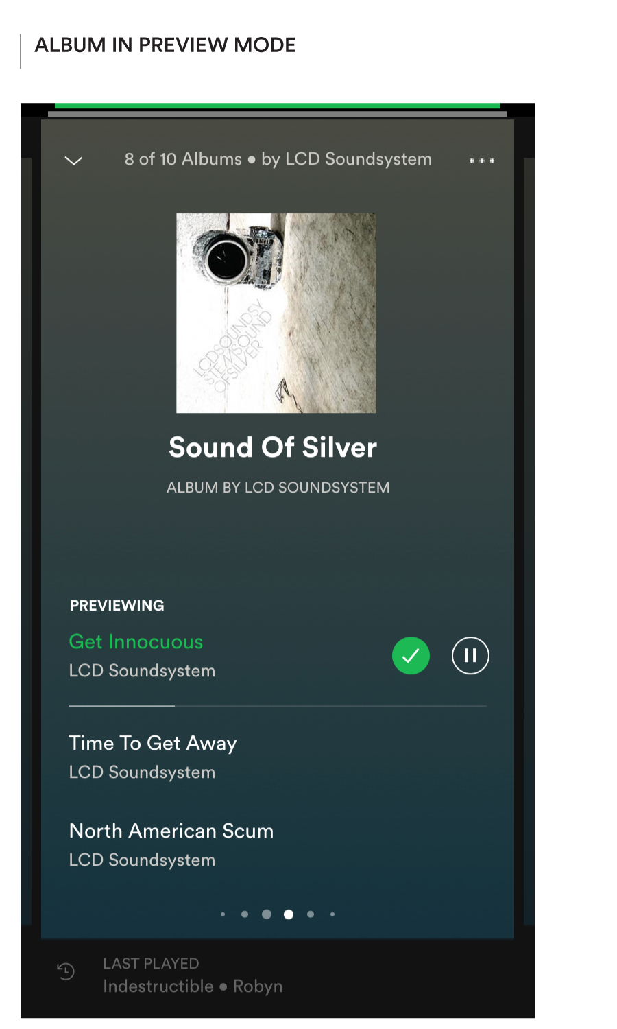
Preview Mode at various levels (content nodes)

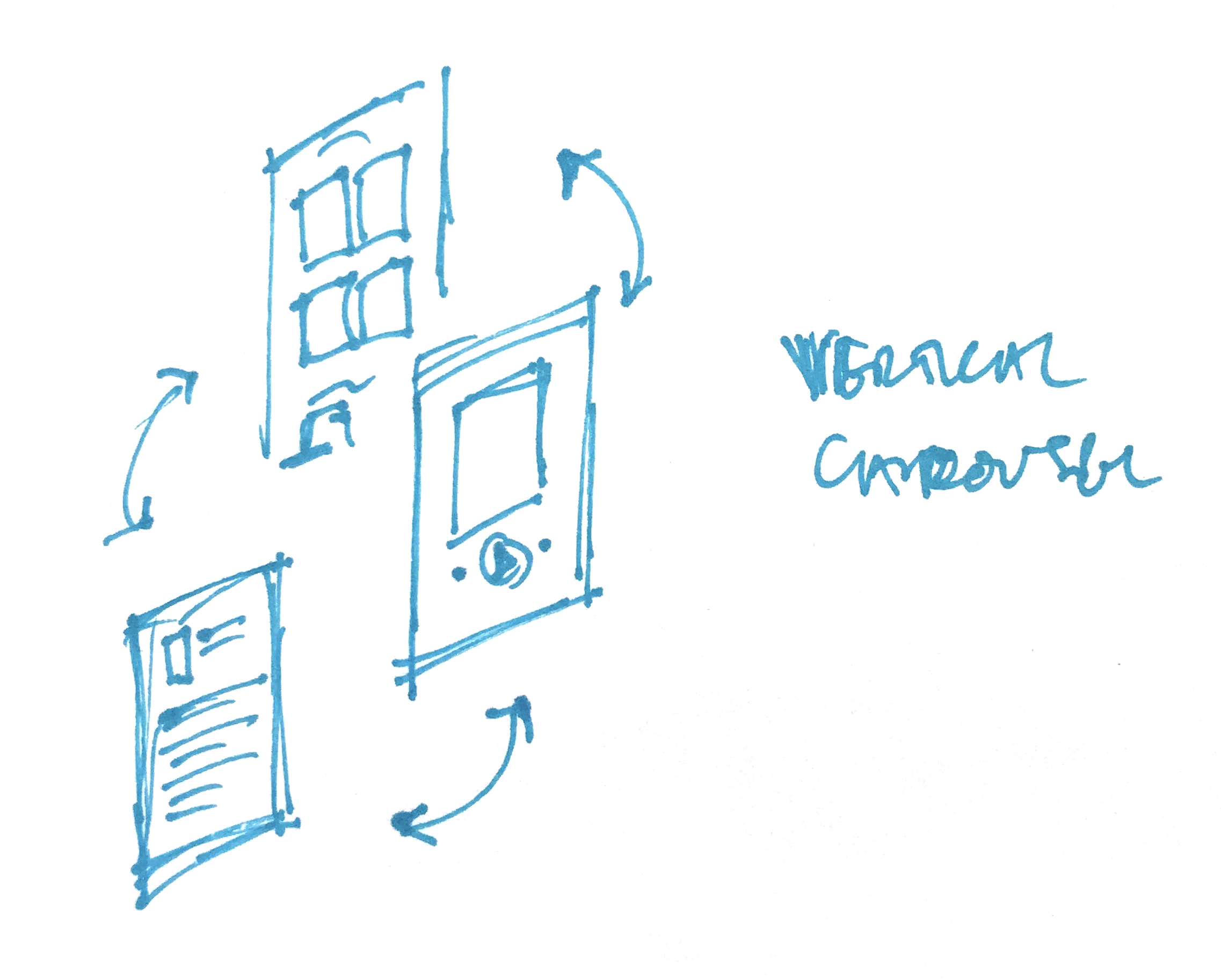
Basic Navigation – Lateral Movement
Supporting an easier way to preview would also suggest the opportunity to develop an easier way to browse the hierarchy.
Lateral Movement, e.g. between albums by an artist, playlists in a genre, recommendations from my friends, etc. currently requires navigation back ‘up’ the tree to the parent node in order to go ‘down’ again. It never feels great because it’s just inherently inefficient.
The lateral swipe capability is already enabled for switching between tracks on the Now Playing screen, where the horizontal axis is the obvious way to organize sibling nodes. The same gesture — from the edge of the screen — would work just as well when viewing any node in a list.

Horizontal swipe to navigate laterally between albums by an artist
Or between playlists in a genres, or any other set of nodes in a list
By making the presentation of each node more card-like — with the current node delimited to a part of the screen, and room left for the presentation of other nodes around its periphery — we could also reinforce the concept of each content unit (song, album, artist, playlist, genre) being a node in the network, existing in some relationship — and thereby connected — to other nodes.

Basic Navigation – Vertical Movement
Vertical Movement could be made more efficient too by using more of the top row as the tap area, and also allowing for the same via a strong downward flick when the screen has scrolled to the top (à la Inbox).
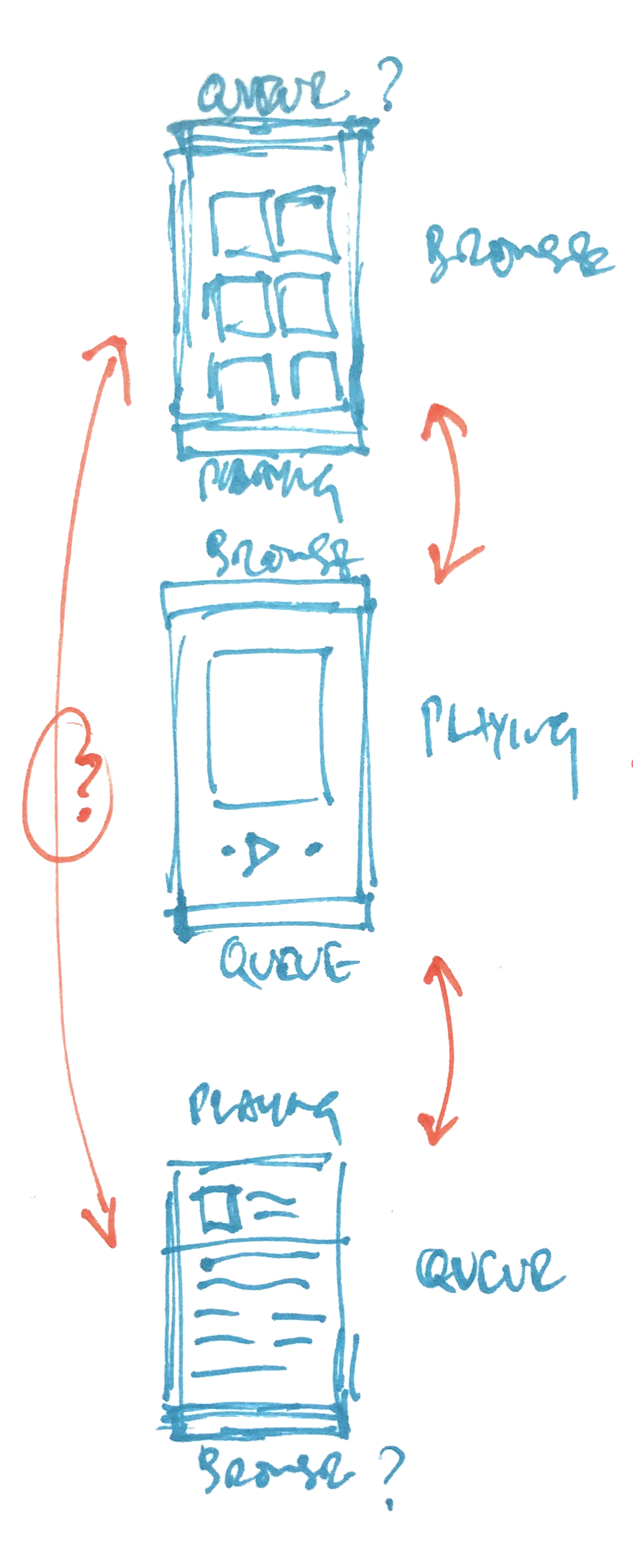
Linear vs. circular models for vertical gestural navigation between different views/concepts
Tap the top row or flick the screen down when scrolled to the top to navigate back up
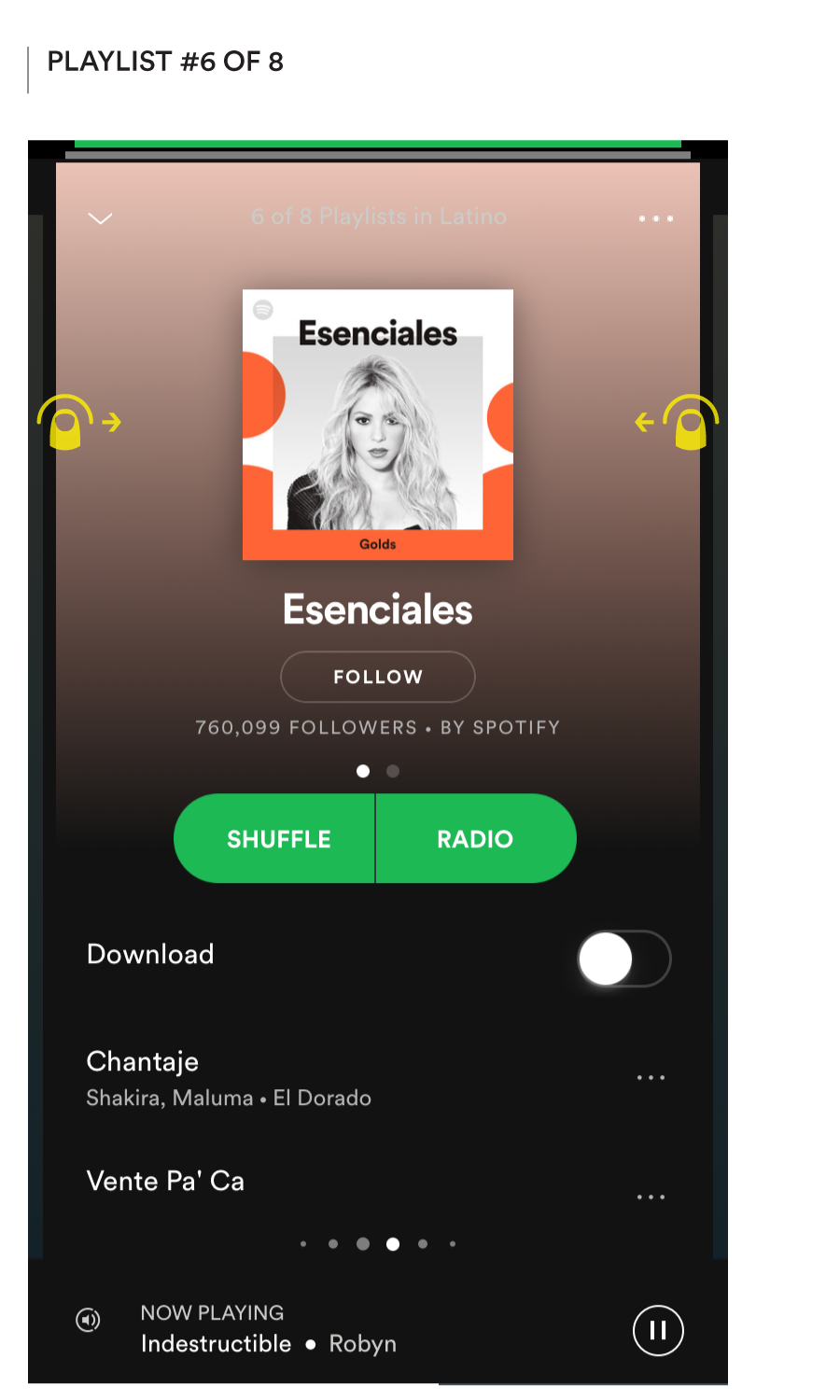
At the bottom of the screen, the persistent presentation of the Now Playing track as a row below the content browsing area also suggests the opportunity to apply the same UI component in the Now Playing view to enable easier access to what’s Up Next.
(I’d bet that the fraction of users more actively managing their queue would increase through more obvious access to the capability which is currently tucked away behind an icon in the top right corner.)
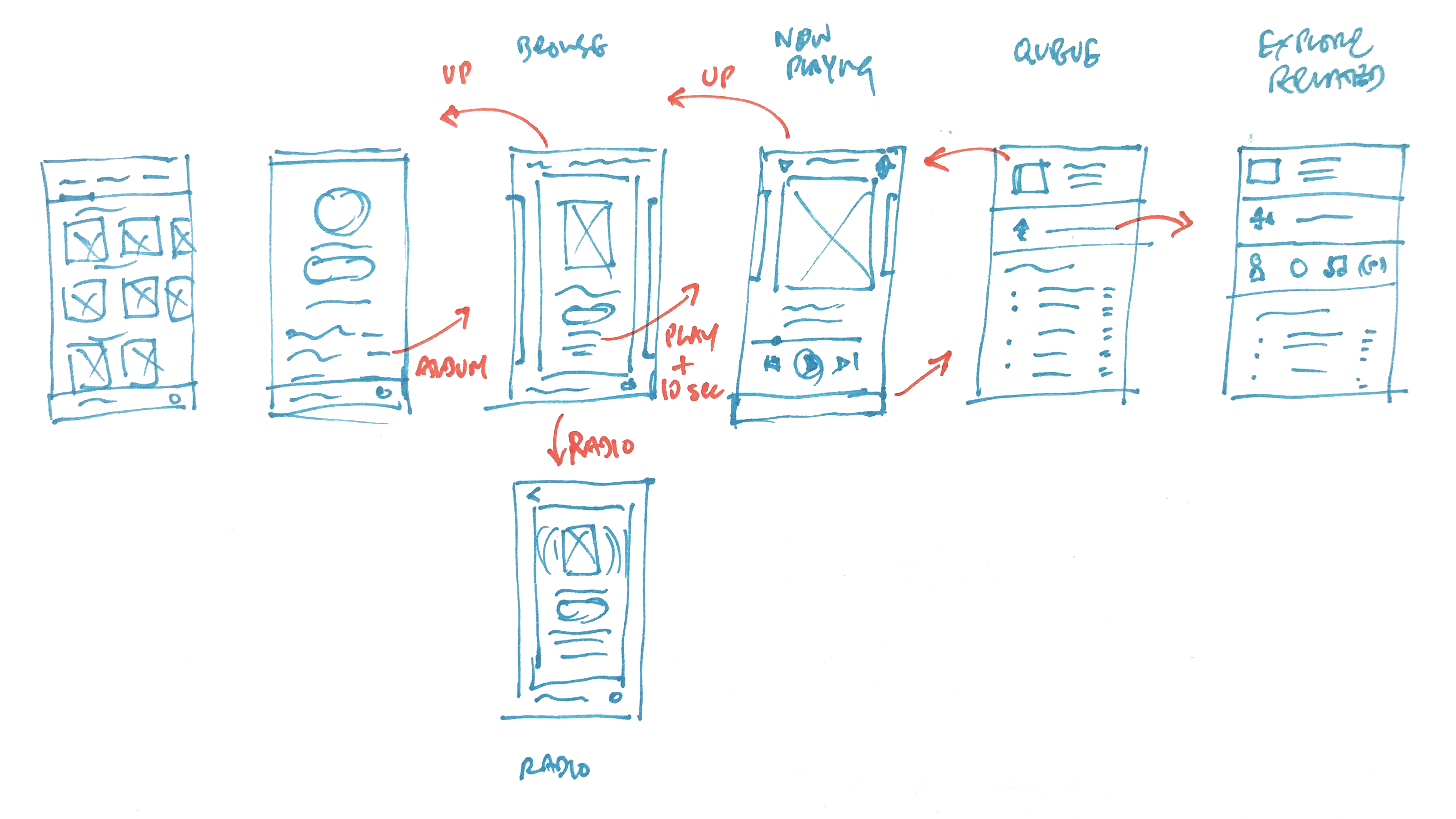
Flow connecting various views/concepts – Top level, Artist, Album, Now Playing, Up Next, Related Content – through vertical tap/swipe gesture navigation
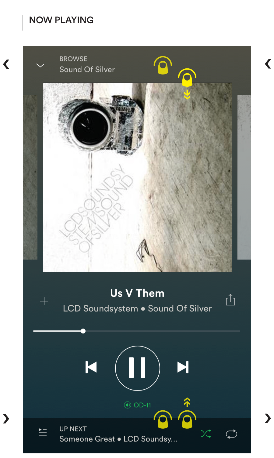
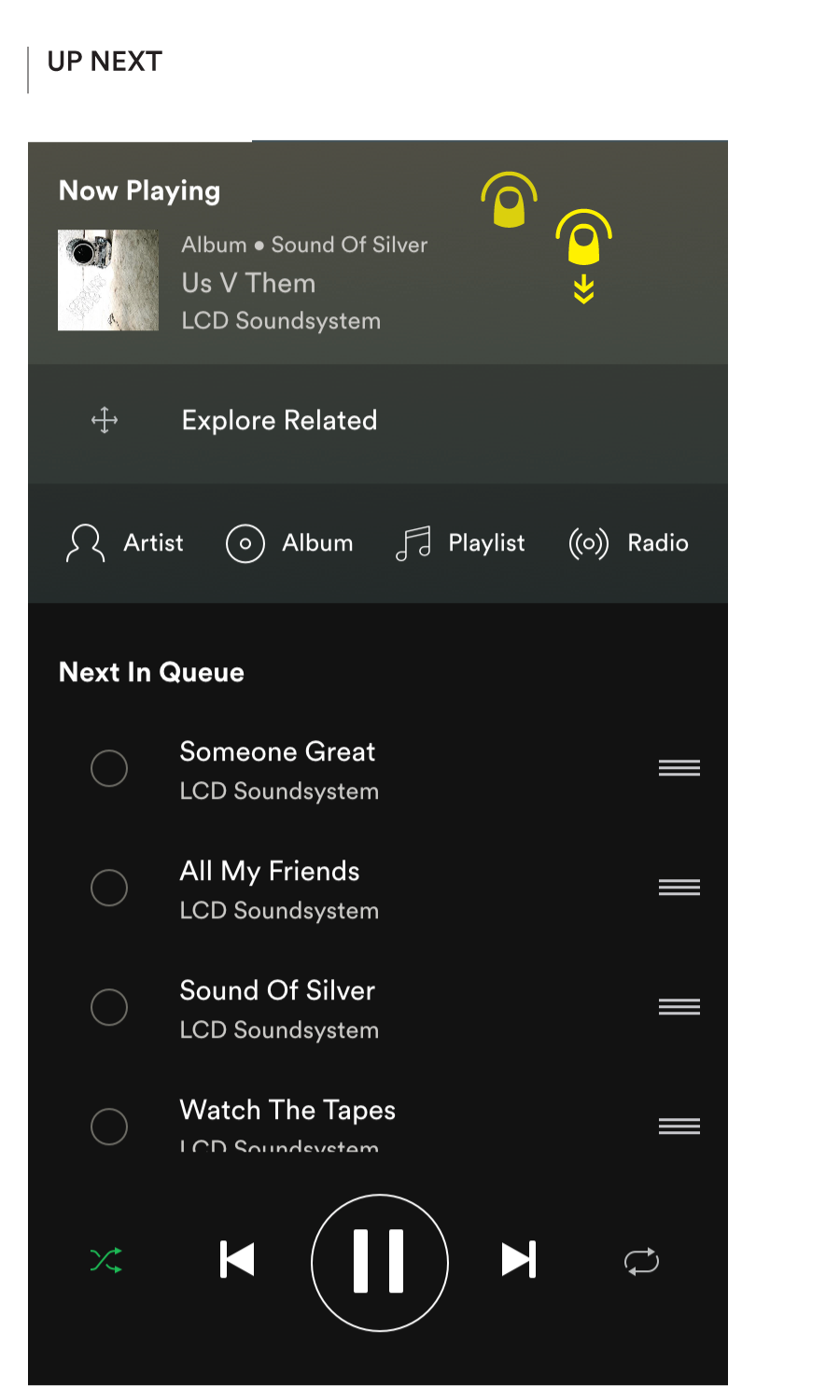
Tap or swipe up the bottom row to reveal Playing Now or Up Next. Tap or swipe down the top row to back up
And the Tab Bar? Ok, if you’ve had the patience to read this far, you probably have some questions regarding the decision to replace the standard iOS tab bar with Android-esque tabs across the top. It was primarily driven by a desire to keep the bottom of the Home screen clear for a quick tap or swipe up and apply a consistent vertical swipe pattern to navigate between Browse, Now Playing, and Up Next. The efficiency of being able to select a tab with the thumb is easily replaced by a horizontal swipe gesture to navigate between the tabs.
Radio
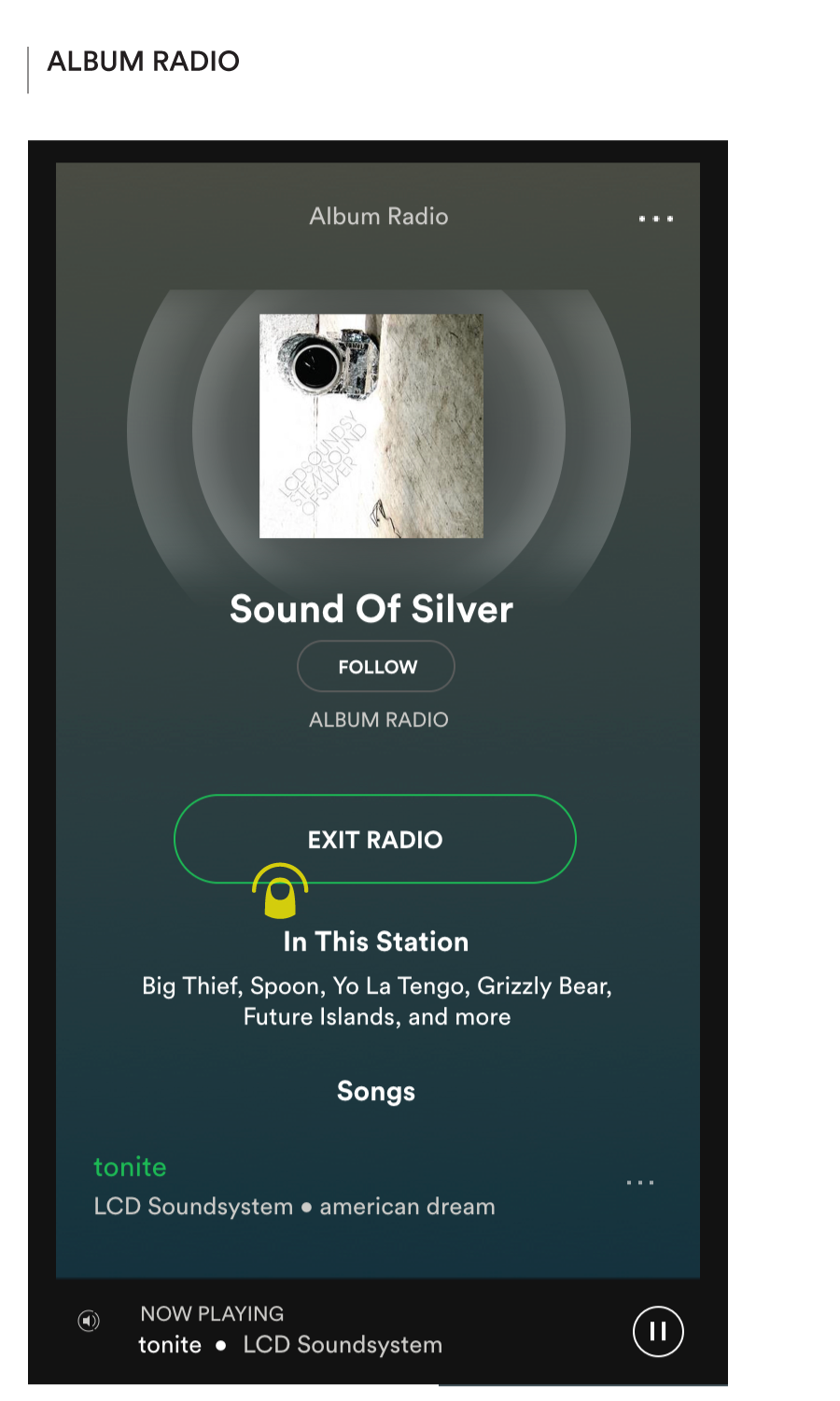
Radio is already available for every node type — playlists, songs, albums, artists and genres/moods — but presented explicitly only on genres. On the rest it is tucked away behind a ‘…’ (more) menu. I’ve already discussed the redundancy of having a parallel hierarchy in the current Radio section.
Given its potential for loosening up the way that listeners relate to the catalog just as Shuffle Play did a few years ago (self-declared “Album Purists”, just let the hate flow through you!) I would argue that Radio would be better incorporated into the experience as an explicit listening option for every applicable node.
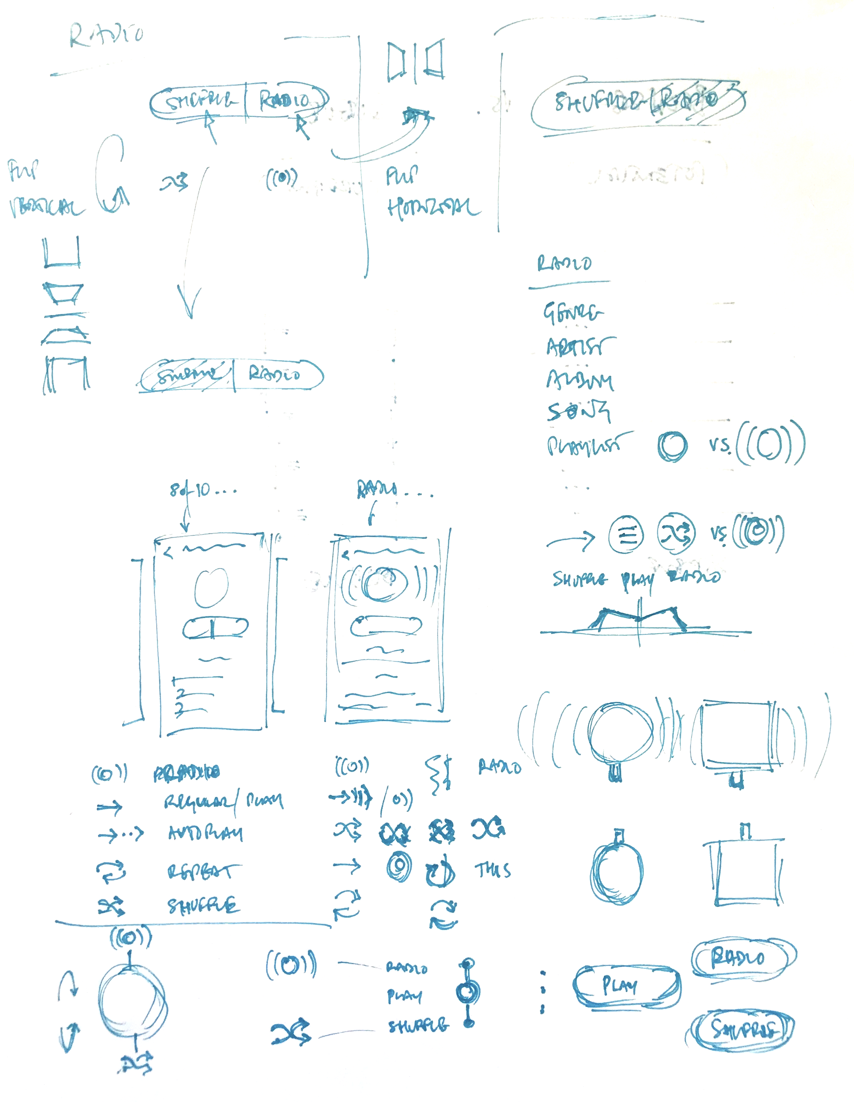
Exploratory sketches of various aspects of the Radio feature
I propose that Radio and Shuffle are offered as paired play options within a split of the big green button. I am also acutely aware of the potential downside of the friction introduced by a more complex primary action, so a lot of exploration and testing would be needed to build confidence in a truly viable interface proposition for this.
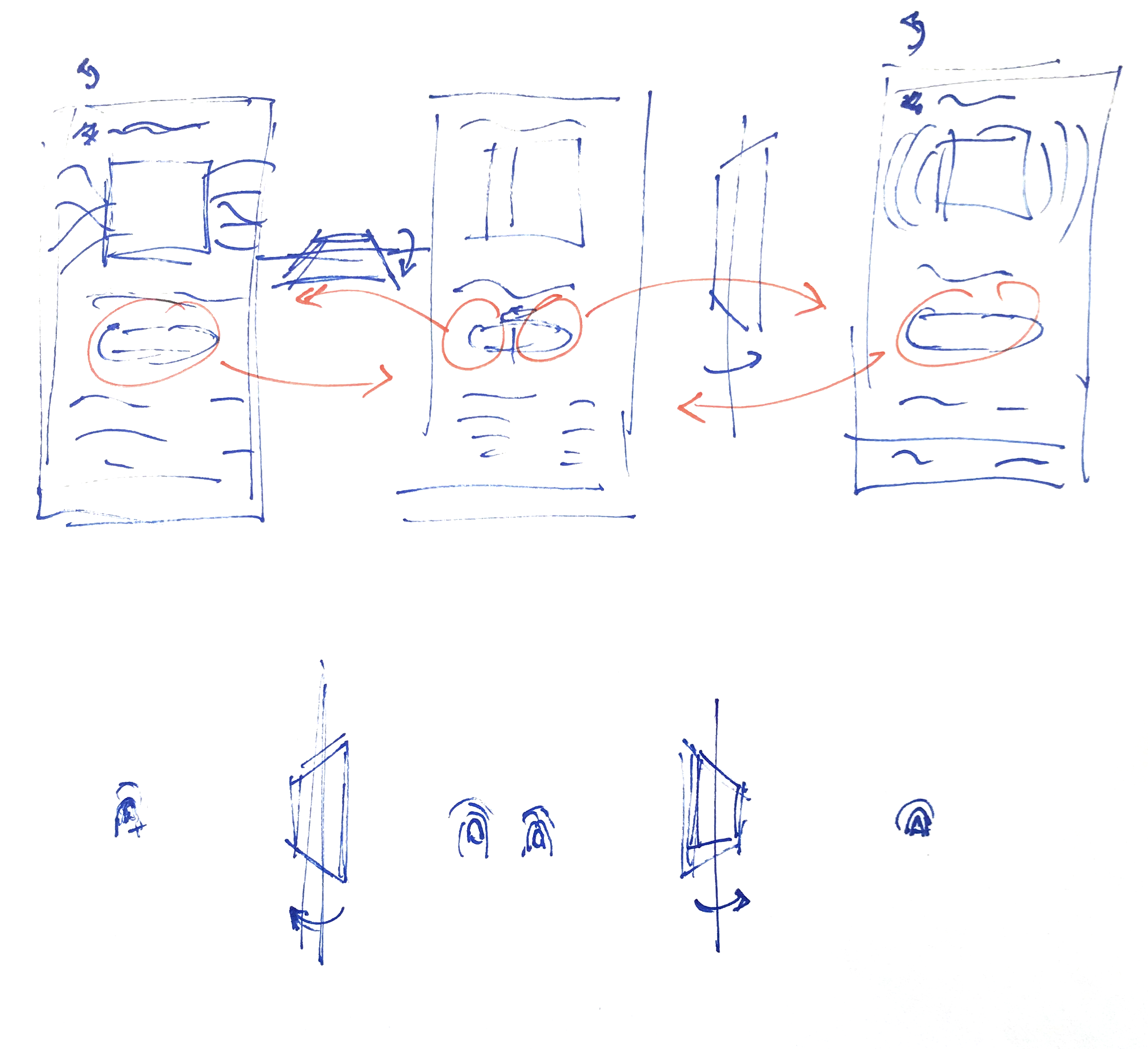
Vertical vs. Horizontal modesl for flip gesture navigation between Regular Play, Shuffle Play, and Radio
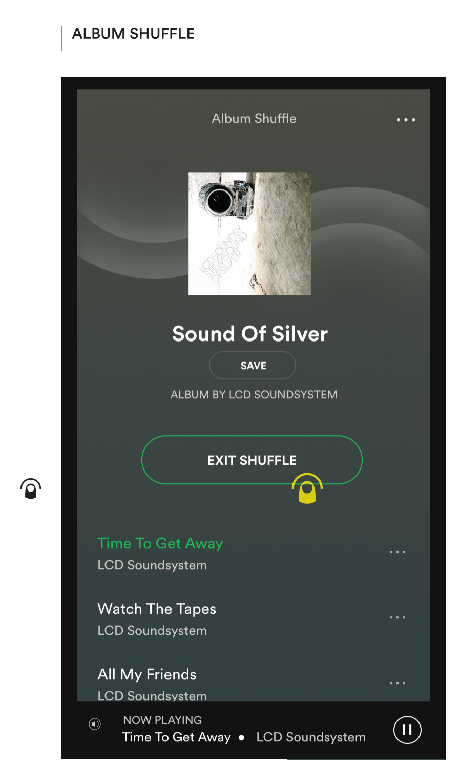
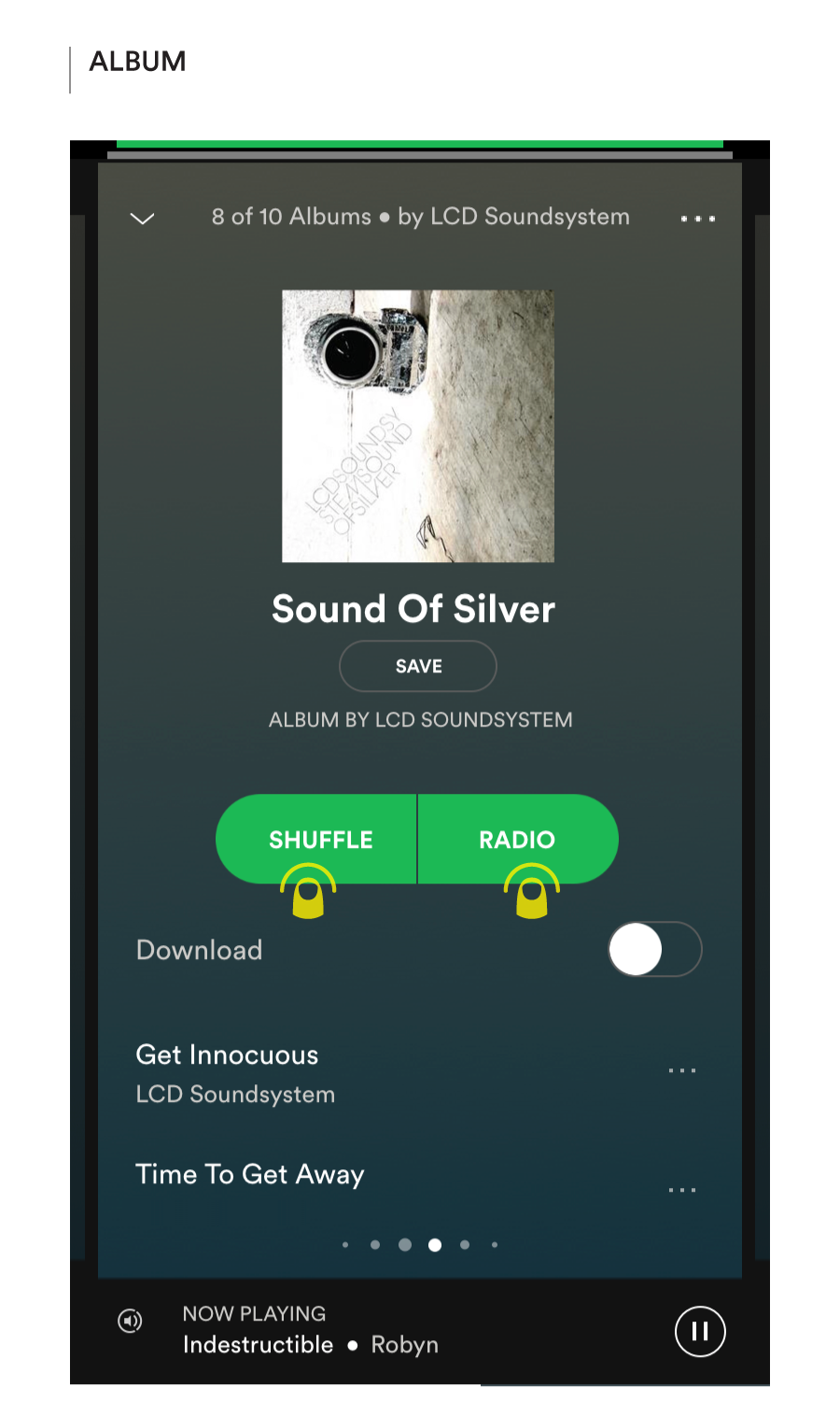
Shuffle and Radio are accessed through a split play button
Social
Music is a social experience — intimately tied to the definition and expression of our identity and the way we relate to people — and no one seems to be tapping into that; not really. This topic is easily meaty enough to merit its own full-length investigation, so I will limit the exploration here to the aforementioned proposal to incorporate Friend Activity into the Discover tab using the same bi-level grouping UI as applied to More Like Your Recent Listening. It’s just a start.
Next Up
Here’s a list of the topics I anticipate taking on in future rounds, i.e. the list of issues I haven’t sufficiently processed yet:
Playlist artwork & the art of the album cover
Synesthesia: Previewing music with richer narrative context
Social discovery: The return of the mix tape
Merchandising for one (everyone)
Dynamic genres & moods: Unpacking the Daily Mix
Could Auto-Play Similar or Boil the Frog be the “Uber Pool (yes, cringe!) of music” ?
Queue management
Following, hearting, saving, and downloading. Why so confusing
Advanced catalog exploration
Integrating Genius, WhoSampled, Wikipedia, etc.
Other Projects
Pimp My SpotifySystems / Entertainment
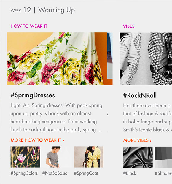
Cult CollectionSystems / Fashion
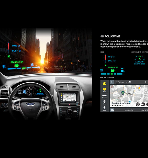
Scout NavigatorSystems / Automotive
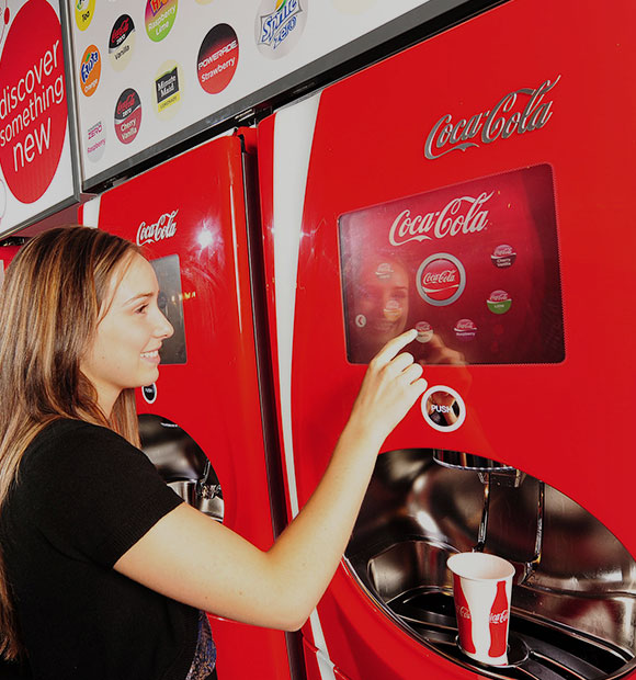
Coca- Cola FreestyleSystems / Food Service
Home Depot MobilitySystems / Retail

Prada Epicenter NYSystems / Retail
Taco Bell Omni-ChannelSystems / Food Service
OpenTable On-BoardingSystems / Operations

Mi Ola SurfBrand / Strategy
Smart Grid RolloutCommunications / Strategy

Cultural LootCommunications
Infinity > Infinity + 1Computational Art / Binary
MatrixComputational Art / Binary
WiresComputational Art / Binary
ShuffleComputational Art / Games